What Makes Amy Sherald’s Paintings So Powerful?
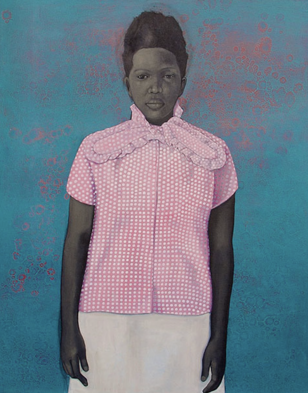
Amy Sherald’s paintings are powerful because they make visibility feel dignified, composed, and withheld.
Her portraits are immediately recognizable: Black figures rendered in gray skin tones, set against flat fields of color, wearing bold clothing, occupying poses that feel poised, frontal, calm, and self-possessed. The works are visually direct, but psychologically guarded. The subjects are presented to us, but not surrendered to us.
That is the central tension in Sherald’s work:
Being seen does not mean being known.
This makes her extremely useful for thinking about identity, visibility, performance, and the private self becoming a public image.
Portraiture Without Possession
Sherald’s work returns to a durable problem:
How can portraiture make Black subjects visible without making them available for consumption, stereotype, or possession?
That question gives her paintings their force.
Sherald is widely known for depicting Black Americans in everyday settings and for using grisaille — shades of gray — for skin tone, a decision associated with challenging conventions around skin color and race. She won the National Portrait Gallery’s Outwin Boochever Portrait Competition in 2016 for Miss Everything (Unsuppressed Deliverance) and later painted the official portrait of Michelle Obama. (Wikipedia)
The gray skin is crucial. It is not just a signature device. It changes how the viewer reads the body.
Skin color, one of the most socially charged visual facts in American life, is partly suspended. The figure remains Black, but the skin is not rendered through naturalistic racial color coding. This creates a strange and powerful distance. The viewer must look differently.
Sherald’s figures are visible, but they resist being reduced.
A World of Poise, Color, and Withholding
Sherald has created a distinct visual world built from a few highly controlled elements:
gray skin
flat color backgrounds
bold clothing
frontal or composed poses
clear silhouettes
minimal settings
quiet facial expressions
fashion as identity
stillness
dignity
restraint
The work often feels calm, but not passive. The calmness is a form of control.
Her portraits do not usually dramatize suffering or struggle. They often show figures in states of composure, leisure, style, self-possession, or quiet confidence. A recent major exhibition, American Sublime, was described as spanning nearly fifty works and emphasizing beauty, majesty, emotional depth, joy, autonomy, and power in Black life, rather than centering only suffering or marginalization. (Vogue)
That matters because Sherald’s work creates a counter-image.
The figures are not asked to perform pain for the viewer. They are not flattened into social problem, tragedy, or documentary evidence. They occupy pictorial space with authority.
This is one reason the paintings feel so still. Stillness becomes sovereignty.
The Pressure Beneath the Calm
At first glance, Sherald’s work may seem less obviously pressurized than artists like Jenny Saville, Lisa Yuskavage, or Tracey Emin. There is no overt physical distortion, raw confession, or erotic discomfort.
But the pressure is there. It is just controlled.
The pressure comes from the history of representation: who has been painted, who has been excluded, who has been made visible, who has been stereotyped, who has been denied leisure, who has been denied grandeur, who has been denied softness, who has been denied the right to simply appear.
Sherald’s paintings often ask:
Who gets to be iconic?
Who gets to be ordinary?
Who gets to be beautiful without explanation?
Who gets to be composed?
Who gets to be mysterious?
Who gets to withhold interiority?
Who gets to be painted at scale?
This is why the paintings’ restraint is not thin. The restraint is charged by history.
Fashion as Public Self
Clothing is one of Sherald’s most important formal tools.
Her subjects often wear striking dresses, coats, hats, prints, patterns, or bold silhouettes. Fashion becomes a way identity is staged, but not simplistically revealed. The clothes are expressive, but the faces remain restrained. The garment may be colorful and declarative, while the person remains composed and unreadable.
This creates a powerful contradiction:
public style, private self
visibility, withholding
bold clothing, quiet face
iconic pose, ordinary person
racial specificity, gray suspension
individual presence, symbolic force
The clothing does not merely decorate the figure. It mediates visibility.
For your own work, this is a major lesson. Style can become psychological if it controls the relationship between public image and private interiority.
The Michelle Obama Portrait
Sherald’s official portrait of Michelle Obama made this language visible to a mass audience.
The painting shows Michelle Obama in Sherald’s signature gray skin tone, seated against a sky-blue background, wearing a geometric-patterned white dress that expands across the canvas. The National Portrait Gallery commission made Sherald and Kehinde Wiley the first African American artists to receive official presidential portrait commissions from the institution. (Wikipedia)
What is interesting is that the portrait is both public and private.
Michelle Obama is one of the most visible women in American public life. But Sherald does not paint her as spectacle, celebrity, political symbol, or polished media image. She becomes composed, thoughtful, monumental, and withheld.
The dress becomes architecture.
The body becomes calm.
The background becomes open space.
The face becomes quietly present but not fully disclosed.
The portrait is public, but it protects something private.
That is the Sherald move.
Why the Choices Feel Necessary
Sherald’s formal choices are unusually clear.
The gray skin is necessary because it interrupts automatic racial reading while keeping race present.
The flat backgrounds are necessary because they remove narrative distraction and create iconic space.
The clothing is necessary because it carries individuality, self-fashioning, cultural code, and public image.
The restrained expressions are necessary because the subjects retain interiority.
The scale is necessary because it grants presence, importance, and pictorial authority.
The clarity is necessary because the paintings are not about confusion. They are about presence under control.
A weaker artist might use flat color because it looks contemporary. Sherald uses flat color to create a stage of visibility.
A weaker artist might use fashion because it looks stylish. Sherald uses fashion to show how identity is publicly composed.
A weaker artist might paint simplified portraits because they look clean. Sherald simplifies because the work is about dignity, recognition, and withholding.
What Artists Can Learn from Sherald
The lesson is not to imitate the gray skin, flat backgrounds, or stylish portraits.
The lesson is:
Visibility can be powerful when it is controlled.
Sherald shows that a figure can be fully presented and still not fully given away. A person can be visible, iconic, fashionable, beautiful, and composed while maintaining privacy.
The figure becomes image, but the image does not consume the person. The subject remains self-possessed.
That raises a great studio question:
How can the figure be seen without being surrendered?
Or:
What part of the figure remains private, even when the image becomes public?
Closing Insight
Amy Sherald’s greatness is not that she paints stylish portraits of Black subjects. It is that she makes visibility feel dignified, iconic, historically charged, and withheld. Her subjects are seen, but not possessed. They become public images while protecting the private self within.
What Makes Njideka Akunyili Crosby’s Work So Powerful?
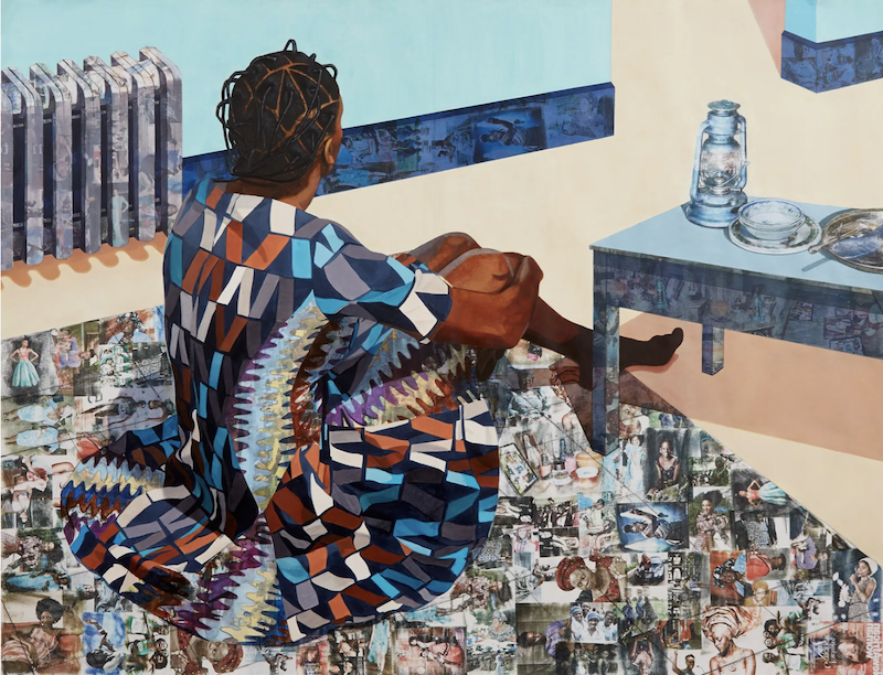
Njideka Akunyili Crosby’s work is powerful because she turns the interior into a place where identity is made, remembered, divided, and recombined.
Her paintings are filled with figures, rooms, patterned fabrics, domestic furniture, family photographs, Nigerian pop culture, magazine imagery, architectural fragments, and layered photo transfers. At first, they can seem intimate, decorative, or domestic. But the deeper force of the work is that every surface carries history. A wall is not just a wall. A floor is not just a floor. A dress is not just a dress. A room is not just a room.
In Akunyili Crosby’s work, the environment does not sit behind the figure. It acts on the figure.
That makes her especially important for what we are studying now.
Identity Between Worlds
Akunyili Crosby’s central problem is not simply cultural identity. It is the experience of inhabiting multiple worlds at once.
Born in Nigeria and based in Los Angeles, she has often been discussed in relation to diaspora, domestic space, cross-cultural experience, and life between Nigeria and the United States. Her work uses painting, drawing, collage, and photo-transfer processes to negotiate the terrain between her Nigerian background and her American life, often through interiors and intimate scenes where personal, familial, and cultural histories overlap. (Wikipedia)
The deeper question might be:
How can painting show identity as something made from overlapping cultural, domestic, familial, historical, and visual worlds?
That is the generative problem.
Her paintings do not present identity as a fixed essence. They present identity as layered. It is built from memory, place, family, image culture, migration, intimacy, furniture, clothing, wallpaper, photography, and the small details of domestic life.
This is why the interiors matter so much.
The interior becomes a psychological and cultural field.
Pattern Is Not Decoration
Akunyili Crosby is one of the clearest examples of why pattern can be serious.
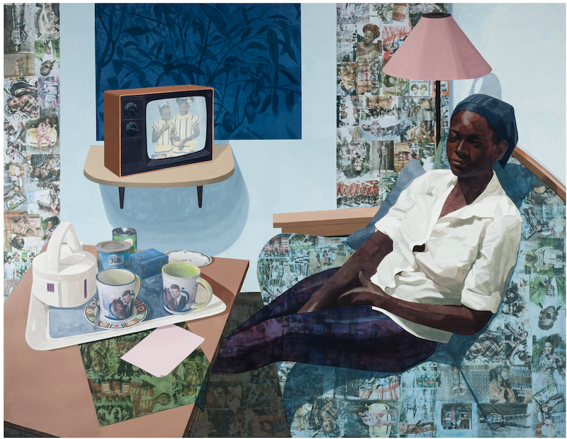
The patterns in her work are visually beautiful, but they are not merely decorative. They carry memory, culture, class, intimacy, place, gender, and history. Clothing, walls, furniture, floors, and photographic transfers become overlapping identity systems.
Her work often incorporates personal photographs, family images, Nigerian magazine imagery, and popular culture through collage and acetone-transfer techniques, creating layered surfaces that function almost like a fabric of memory. (Wikipedia)
That means pattern is doing several things at once.
It beautifies the image.
It locates the figure culturally.
It creates visual pleasure.
It carries memory.
It connects public images to private interiors.
It makes the figure and environment interdependent.
It turns surface into archive.
This is the key lesson:
Pattern becomes powerful when it stops decorating the surface and starts carrying the pressure of identity.
That is very relevant to your own work.
The Figure and the Room Are Entangled
One of the most important things about Akunyili Crosby’s work is that the figure and the room are not separate.
The figure belongs to the room, but the room also shapes the figure. The body may be painted in one register, while the surrounding walls, floors, clothing, or furniture contain transferred images. A figure may appear still and quiet, while the surfaces around them pulse with historical and cultural information.
This creates a powerful contradiction:
quiet domestic scene, dense historical field
private interior, public archive
intimacy, distance
belonging, displacement
presence, fragmentation
home, migration
memory, constructed image
Her works are often intimate, but they are not simple. They are quiet on the surface and deeply layered underneath.
This is why they reward sustained looking. The first glance gives you a figure in a room. The longer look reveals the room as an archive, the surface as memory, the pattern as identity, and the domestic scene as a site of cultural negotiation.

The Domestic Interior as a Cultural System
Akunyili Crosby’s interiors are not neutral spaces.
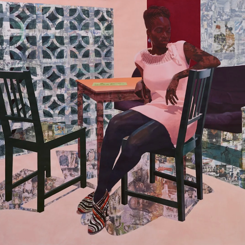
A living room, bedroom, floor, sofa, wall, table, or curtain becomes a cultural system. These spaces hold migration, marriage, family, class, memory, and the pressure of being shaped by more than one cultural world.
The New Yorker described her paintings as “intimate universes” of an African diaspora situated between two worlds, often depicting domestic interiors and private social gatherings layered with vernacular images from Nigeria. (The New Yorker)
That phrase — intimate universes — is useful.
Her rooms feel intimate because they are personal and domestic. But they are universes because they contain entire systems of history, memory, and cultural translation.
The room becomes a world.
This is why Akunyili Crosby’s work is more than portraiture, more than interior painting, and more than collage. It is a way of showing how identity forms through layers.
Why the Choices Feel Necessary
Akunyili Crosby’s formal choices are tightly connected to her problem.
The photo transfers are necessary because identity is mediated through images, memory, family archives, and popular culture.
The interiors are necessary because identity is lived domestically, relationally, and privately.
The patterns are necessary because culture enters daily life through surfaces: fabric, wallpaper, furniture, clothing, floors, and objects.
The layering is necessary because diaspora identity is not singular. It is built from overlap.
The quiet figures are necessary because the pressure often sits around them rather than in overt drama.
That is high-level art: formal decisions that are not effects, but ways of thinking.
A weaker artist might use collage because collage looks layered. Akunyili Crosby uses collage because her subject is layered being.
A weaker artist might use pattern because pattern is beautiful. Akunyili Crosby uses pattern because identity lives inside surface.
A weaker artist might paint interiors because interiors are intimate. Akunyili Crosby paints interiors because rooms hold cultural memory.
What Artists Can Learn from Akunyili Crosby
The lesson is not to imitate her photo transfers, Nigerian imagery, domestic interiors, or patterned surfaces.
The lesson is to ask:
What does the environment know about the figure that the figure does not say directly?
That is a major studio question.
Akunyili Crosby shows that place does not need to be a background. It can become an identity system.
A room can pressure a figure.
A pattern can carry memory.
A dress can hold cultural code.
A wall can become an archive.
A surface can reveal belonging and displacement.
A domestic space can contain multiple worlds.
If the environment is acting on the figure, then the boundaries between figure and field should become unstable. Pattern, color, image, place, and body can begin to merge because the person is being shaped by what surrounds them.
That is not abstraction as style. That is abstraction as identity pressure.
Closing Insight
Njideka Akunyili Crosby’s greatness is not that she paints patterned interiors beautifully. It is that she makes pattern, room, figure, memory, and image culture become one system for showing what it feels like to inhabit multiple worlds at once.
What Makes Sarah Sze’s Work So Powerful?
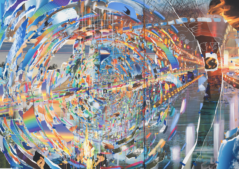
Sarah Sze’s work is powerful because it turns perception into a material problem.
Her installations and paintings do not simply present images, objects, screens, fragments, or found materials. They create unstable systems where the viewer has to reconstruct meaning from partial information. Looking becomes active, uncertain, bodily, and time-based. The work feels like a model of contemporary attention: scattered, overloaded, luminous, fragile, searching, and always on the edge of collapse.
Sze’s practice matters because she makes the instability of seeing feel physical.
The Problem of Perception
Sze keeps returning to a deceptively simple but profound question:
How do we locate ourselves in a world of proliferating images, objects, memories, signals, and fragments?
That question connects her installations, sculptures, videos, paintings, public works, and architectural interventions.
Gagosian describes her 2026 exhibition Feel Free as redefining collage as a spatial and temporal language across media, turning the image itself into sculptural material. The exhibition’s works explore how senses, emotions, and memories are conditioned by a media-saturated world, and how perception itself becomes a material of the work. (Gagosian)
That is the key. Sze is not just arranging fragments because fragmentation looks contemporary. She is asking how meaning is built when images no longer sit still.
A photograph becomes an object.
A projection becomes a surface.
A screen becomes a light source.
A table becomes a planetarium.
A sculpture becomes a time system.
A room becomes a field of attention.
Her work asks the viewer to navigate, not merely observe.
A World of Fragile Systems
Sze has created one of the most recognizable visual worlds in contemporary installation.
Her world includes:
thin rods,
paper fragments,
projected images,
small screens,
mirrors,
lights,
tools,
tables,
tape,
string,
photographs,
video loops,
paint,
shadows,
architectural scaffolds,
and everyday objects suspended inside delicate systems.
The materials often look temporary, provisional, and almost impossibly fragile. But the work is not random. It is highly structured. The apparent chaos is held by a precise internal logic.
Columbia University describes Sze’s body of work as spanning sculpture, painting, architecture, and public installation. It notes that she investigates how artworks ascribe meaning to the places and times we inhabit while navigating the ceaseless proliferation of images and objects in contemporary life. The same profile credits her with dismantling the static nature of sculpture, expanding installation, and broadening the language of painting. (Columbia Arts)
That description gets to the center of her visual world. Sze does not treat sculpture as a stable object. She treats it as an event: something unfolding in time, space, and perception.
Her installations often feel like laboratories of seeing. Everything seems to be in the middle of becoming something else.
Why the Surface Feels Charged
The pressure in Sze’s work comes from the tension between order and collapse.
The works often look as if they could fall apart, but they do not. They seem improvised, but they are intensely composed. They feel chaotic, but they are governed by balance. They contain ordinary things, but those things become cosmic, fragile, and strange.
A cardboard box may become architectural support.
A torn image may become a landscape.
A projected light may become atmosphere.
A screen may become a memory fragment.
A tool may become part of the skeleton of the work.
A table may become a universe.
Gagosian’s Feel Free text says the exhibition is organized across three interconnected galleries, each with a different relationship to light, material, and time. Images move across constructed forms, fall into shadow, splinter into color, and return as traces. (Gagosian)
That movement is important. Sze’s surfaces are not static. Images travel, break, reappear, and dissolve. Meaning does not sit in one place. The viewer has to chase it.
This is why the work can feel both playful and anxious. The fragments shimmer, but they also make you aware of how unstable attention has become.
Images as Debris
Sze’s work often feels like it belongs to a world after image overload.
We are surrounded by pictures: phone images, news images, memory images, advertising images, false images, private images, public images, stored images, lost images, scrolling images. Sze does not simply depict that condition. She builds spatial environments that behave like it.
Her official biography describes her immersive works as challenging the static nature of art and questioning the value society places on images and objects, and how both ascribe meaning to the places and times we inhabit. It also notes that her work ranges from intimate paintings that collapse time and space to expansive installations that create complex constellations of materials and public works that scale walls and colonize architectures. (Sarah Sze)
That phrase — complex constellations of materials — is very useful.
A constellation is not a single image. It is a pattern made from separate points. The viewer has to connect them.
This is how Sze’s work operates. She gives us fragments, but not a stable whole. The viewer becomes responsible for making temporary sense of the system.
The Viewer Inside the System
Sze’s work implicates the viewer through movement and attention.
You cannot see everything from one place. You have to move. You look up, down, across, through, around, behind. You follow projections, then lose them. You notice a tiny object, then realize it participates in a larger network. You step back and see the whole installation, then move closer and watch it dissolve into parts.
A recent Guardian piece on Feel Free summarizes the exhibition as exploring perception, temporality, and disorientation in the digital age, with works that ask viewers to actively navigate and reconstruct meaning amid fragmented information. (The Guardian)
That is exactly why the work has force.
The viewer does not receive meaning passively. The viewer performs the instability that the work is about.
This separates Sze from artists who merely use technology, screens, or fragments to look contemporary. In Sze, the scattered field of information becomes a lived experience.
Why the Work Lasts
Sze’s work lasts because it holds contradiction.
It is fragile and monumental.
Playful and anxious.
Improvised and precise.
Ordinary and cosmic.
Technological and handmade.
Scattered and coherent.
Temporary and deeply structured.
Beautiful and precarious.
Material and immaterial.
Image and object.
Memory and debris.
Those contradictions keep the work from becoming merely spectacular.
If it were only complex, it might become visual clutter.
If it were only technological, it might become novelty.
If it were only delicate, it might become precious.
If it were only immersive, it might become entertainment.
The strength is that the work keeps all of these forces in tension.
What Artists Can Learn from Sze
The lesson is not to imitate Sze’s fragments, rods, projections, screens, or installations.
The lesson is to make form behave like perception.
A weaker artist might think:
“I should add more fragments, images, or installation elements.”
A stronger lesson would be:
“What kind of perceptual problem does my work ask the viewer to experience?”
Sze shows that complexity becomes powerful only when it is governed by a real pressure. Her fragments are not just decorative debris. They model the way memory, attention, media, and meaning break apart and reassemble in contemporary life.
The work asks a question every artist can learn from:
What does my work make the viewer do in order to see?
That is the deeper lesson.
Closing Insight
Sarah Sze’s greatness is not that she makes intricate installations from fragments. It is that she turns fragmentation into a physical experience of perception, memory, attention, and meaning under pressure.
What Makes Theaster Gates’s Work So Powerful?
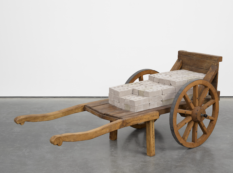
Theaster Gates’s work is powerful because he turns value into a material problem.
His practice asks what happens when discarded materials, neglected buildings, overlooked archives, Black cultural objects, clay, tar, books, music, and labor are treated not as leftovers, but as carriers of memory and future possibility. Gates does not simply make art about preservation, community, or Black history. He makes preservation, community, and Black history behave as materials.
The result is a practice where art is not only something to look at. It is something that repairs, revalues, houses, archives, sings, gathers, and remembers.
The Problem of Value
Gates keeps returning to a durable question:
How can discarded materials, neglected spaces, and culturally significant Black objects be transformed into forms of value, memory, beauty, and collective possibility?
That question links his sculpture, paintings, ceramics, archives, performances, buildings, and social projects.
White Cube describes Gates as an artist, archivist, thinker, and builder whose practice subverts the politics of value and place through the stewardship and redeployment of culturally significant Black objects, legacies, archives, and spaces. The gallery also notes that he trained as both a sculptor and urban planner, and that his work contends with Black space as a formal exercise shaped by collective desire, artistic agency, and pragmatic tactics. (White Cube)
That is central to understanding him.
Gates is not only asking:
What can this object become?
He is also asking:
Who decided this object, building, labor, archive, or neighborhood had no value in the first place?
This gives the work its force. A piece of roofing material, a worn book, a clay vessel, an abandoned building, or a Black magazine archive is never just itself. It carries labor, place, race, class, use, neglect, touch, and time.
A World Built from Tar, Clay, Archives, Sound, and Space
Gates has built a visual world that is broad but coherent.
His recurring vocabulary includes:
tar,
roofing material,
wood,
brick,
clay vessels,
books,
magazines,
archives,
Black cultural objects,
church-like spaces,
monastic sound,
salvaged materials,
South Side Chicago,
and the transformation of buildings into cultural sites.
At first, this range may seem almost too broad. But the work holds together because the same intelligence governs it: the belief that neglected things can be revalued through care, labor, form, and context.
White Cube describes Gates’s Civil Tapestry series, tar paintings, and roofing works as engaging found or discarded materials from his Chicago neighborhood, especially materials with historic and iconic significance, which he repurposes through his artistic lens and modernist art-historical tropes. (White Cube)
That is where his world becomes recognizable.
Tar is not just tar.
Clay is not just clay.
A book is not just a book.
A building is not just a building.
An archive is not just information.
Each becomes a carrier of value.
Why the Materials Feel Charged
The pressure in Gates’s work comes from the collision between vernacular labor and high art.
A roofing material normally belongs above your head, out of sight, protecting a building from weather. Gates brings it into the gallery and makes it visible. He turns the roof into a painting. He makes labor legible.
In his Book Paintings and Spine Works, Gates arranges books in tight formations of minimalist lines and modernist squares. White Cube notes that some works bind copies of Jet and Ebony, Black lifestyle magazines that documented Black experience and shaped Black identity through empowerment and self-invention. Through rebinding, titling, and embossing, Gates overlays narratives of American history with a contemporary Black voice and inserts Black interiority into the canon of art history. (White Cube)
That is a perfect example of how his work operates.
The book is archival.
The arrangement is formal.
The magazine is cultural memory.
The square recalls modernist abstraction.
The binding becomes an act of care and control.
The title becomes voice.
The object is not simply “about” Black history. It physically reorganizes Black history inside the language of high art.
Art as Building
One of the most important things about Gates is that his practice does not stop at objects. It extends into buildings, institutions, and civic life.
The Guardian describes how Gates bought and repurposed neglected buildings on Chicago’s South Side, creating spaces such as Archive House, Listening Room, and other cultural hubs through the Dorchester Projects. The article frames his work as integrating recycled materials, community space, archives, and local urban regeneration. (The Guardian)
This matters because Gates treats architecture as part of artistic practice.
For many artists, social concern remains a topic. For Gates, it becomes infrastructure. The work is not only an image of repair. It performs repair.
That does not mean the art becomes simple activism. Gates’s strongest work keeps aesthetic, material, spiritual, historical, and civic dimensions active at the same time.
A painting may be an object.
A building may be a sculpture.
An archive may be a portrait.
A vessel may be a ritual object.
A performance may activate memory.
A neighborhood may become a site of artistic agency.
This is why his practice feels so expansive without becoming random.
Craft, Labor, and Spiritual Value
Clay is especially important in Gates’s work because it connects craft, touch, humility, transformation, and possibility.
White Cube quotes Gates reflecting that studying clay helped him understand that “ugly things, muddy things, or things that are unformed are just waiting for the right set of hands.” The gallery also describes his vessels as connecting conceptual practices to physical making and serving as an archive of hand gestures, allowing him to move across time periods and cultural influences in search of nuanced forms. (White Cube)
That sentence could describe much of Gates’s practice.
The unformed thing is not worthless.
The discarded thing is not finished.
The damaged place is not dead.
The archive is not inert.
The material waits for transformation.
This is one reason Gates’s work often has a spiritual atmosphere. The act of revaluing material becomes almost devotional. In a Vogue article about his Gagosian exhibition Black Vessel, Gates is described as bringing together enamel, bitumen, wood, copper, torch down, stoneware pots, and archival installations, with the exhibition connected to personal history, global art history, and his Rebuild Foundation work on Chicago’s South Side. (Vogue)
His art is not only about making objects important. It is about treating matter, labor, and memory as worthy of reverence.
Why the Work Lasts
Gates’s work lasts because it holds contradiction.
It is formal and social.
Minimal and archival.
Spiritual and material.
Local and global.
Black-specific and art-historical.
Conceptual and handmade.
Civic and sculptural.
Pragmatic and poetic.
Useful and contemplative.
This is the tension that keeps the work from becoming either social-work documentation or formalist abstraction.
If Gates’s work were only about community, it might lose artistic force.
If it were only about beautiful materials, it might lose ethical force.
If it were only about archives, it might become research display.
If it were only about modernist form, it might become formal exercise.
The strength is that all of these pressures remain active.
What Artists Can Learn from Gates
The lesson is not to start using tar, archives, or salvaged materials.
The lesson is to ask what your materials already know.
Gates shows that material is never neutral. A piece of wood may carry labor. A book may carry cultural memory. A building may carry abandonment and possibility. A vessel may carry touch, ritual, and time. A discarded object may carry evidence of use, neglect, and survival.
A weaker artist might think:
“I should use more found materials.”
A stronger lesson would be:
“What histories, labors, values, and social meanings are already embedded in the materials I choose?”
Gates’s practice shows that art can create value not by pretending the past is clean, but by working with what has been neglected, handled, stored, damaged, or forgotten.
Closing Insight
Theaster Gates’s greatness is not that he makes art from discarded things. It is that he transforms material, place, labor, archive, and Black cultural memory into a practice of revaluation.
What Makes Lorna Simpson’s Work So Powerful?
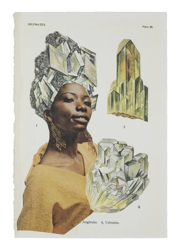
Lorna Simpson’s work is powerful because it makes images withhold as much as they reveal.
Her art is not only about representation, identity, race, gender, or history. It is about the instability of representation itself. What can an image tell us? What does it refuse to tell us? What happens when language seems to clarify an image but actually makes it more mysterious? What happens when the body is fragmented, turned away, partially obscured, or submerged inside history?
Simpson’s work matters because she does not simply make hidden subjects visible. She makes visibility itself difficult.
When Images Refuse to Explain Themselves
Simpson first became widely known for conceptual photography that paired staged images with text. These works often showed Black figures from behind or in fragments, set against neutral backgrounds, accompanied by language that seemed to offer clues but never fully resolved the image.
Hauser & Wirth describes Simpson’s early work as using juxtapositions of text and staged images to raise questions about representation, identity, gender, race, and history. The gallery notes that she was part of a generation of artists using conceptual strategies to undermine the apparent neutrality of language and images. Her figures were often seen only from behind or in fragments, and her text created an “equivocal web of meaning” where what is unseen and unsaid becomes as important as what is disclosed. (Hauser & Wirth)
That is the pressure at the center of Simpson’s work.
The image does not give full access.
The text does not solve the image.
The viewer is not allowed to possess the subject.
This is very different from simple portraiture. Simpson’s work does not say, “Here is who this person is.” It asks why viewers expect images to deliver identity in the first place.
The Problem Beneath the Work
Simpson keeps returning to a deep and durable problem:
How can art expose the limits of images and language in representing race, gender, memory, history, and the self?
That question has allowed her practice to expand across photography, text, collage, film, video, painting, drawing, sculpture, and found imagery without losing its core.
The subject is not merely Black identity or female identity, though both are central. The deeper issue is how identity becomes framed, fragmented, interpreted, misread, archived, projected onto, and withheld.
Hauser & Wirth notes that over more than thirty years Simpson has continued to probe these questions while expanding her practice across media, including film, video, painting, drawing, and sculpture. Her recent work incorporates vintage Jet and Ebony magazine imagery, found photo booth images, discarded press photographs, and natural elements such as ice, continuing to thread paradoxes of figuration and abstraction, past and present, destruction and creation, and male and female. (Hauser & Wirth)
That expansion matters. Simpson is not repeating one successful format. She is returning to the same problem under new conditions.
The question moves from staged photography to collage.
From collage to painting.
From text to atmosphere.
From the body to weather.
From the archive to the environment.
From representation to disappearance.
The problem stays alive because the image never becomes trustworthy enough to settle.
A World of Fragments, Text, Ice, Blue, and Withheld Bodies
Simpson has created a visual world built from partial access.
Her recurring vocabulary includes:
fragmented bodies,
turned backs,
cropped faces,
wigs,
text fragments,
magazine images,
photo booth pictures,
ice,
blue-black atmospheres,
washed-out landscapes,
found photographs,
and images that seem to hover between evidence and dream.
In her early work, the world is often spare and conceptual: bodies isolated against neutral space, text arranged like evidence, images stripped of context. In later work, especially her large paintings, the world becomes more atmospheric and immersive. The image is no longer only withheld through cropping or text. It is submerged in pigment, weather, water, ice, darkness, and blue.
Hauser & Wirth’s text for Darkening describes Simpson’s large-scale paintings as combining figuration and abstraction, with spliced photos and fragmented text abstracted beyond comprehension inside inky washes of black, gray, and startling blue. The exhibition returned to long-standing themes of representation, identity, gender, race, and history while expanding them through vast, poetic tableaux. (Hauser & Wirth)
This is a major shift, but not a break.
The early work withholds through framing and language.
The later work withholds through atmosphere and material.
The world remains Simpson’s because the viewer is still dealing with partial knowledge.
Why the Surface Feels Charged
Simpson’s surfaces feel charged because they contain tension between evidence and obscurity.
Found photographs usually promise access to the real. Magazine images promise glamour, lifestyle, aspiration, beauty, and cultural memory. Text promises clarification. Ice and weather promise natural metaphor. But Simpson does not allow these materials to behave innocently.
A photograph becomes unstable.
A magazine image becomes haunted.
A body becomes partial.
Text becomes fragmentary.
Ice becomes memory, preservation, danger, erasure, and historical chill.
Blue becomes beauty, atmosphere, melancholy, depth, and threat.
In Unanswerable, Hauser & Wirth explains that Simpson continued developing found images from vintage Ebony and Jet magazines, publications that chronicled Black life and culture when those subjects were underrepresented elsewhere. Simpson connected this to fragmentation, saying that fragmentation of the body is prevalent in culture and reflected in her work: people are fragmented both by the way society regulates bodies and by the way people think about themselves. (Hauser & Wirth)
That gives the work its force.
Fragmentation is not just a style. It is social, psychological, historical, and bodily.
The body is fragmented because the image fragments it.
Society fragments it.
Memory fragments it.
Language fragments it.
The viewer’s expectations fragment it.
This is why Simpson’s work can feel quiet and severe but still deeply charged.
The Viewer Becomes Part of the Problem
Simpson’s work implicates the viewer by making looking uncertain.
You may want the image to tell you who someone is.
You may want the text to explain what you are seeing.
You may want the archive to provide historical truth.
You may want the face to become legible.
But Simpson often denies that satisfaction.
The viewer becomes aware of their own habits: reading bodies, assigning identity, trusting photographs, filling gaps, wanting access, assuming that a visible subject is a knowable subject.
This is especially powerful in the early work, where the figures are often seen from behind or in fragments. The subject is present, but not available for easy consumption. The image allows looking while resisting possession.
That resistance is central to Simpson’s intelligence.
Her work does not simply correct misrepresentation by offering a clearer image. It challenges the entire desire for images to make people fully knowable.
Painting After Photography
Simpson’s move into large-scale painting is especially interesting because it does not abandon her earlier concerns. It expands them.
A Vogue profile described Simpson’s move from photography-based art into painting as a radical change, noting large canvases that evoke natural turbulence while continuing her long-standing engagement with race, gender, identity, and image-making. (Vogue)
The recent paintings are not just atmospheric. They transform photographic and archival sources into unstable fields. The image becomes less legible, but more physically present.
This is where Simpson’s work becomes especially useful for painters.
She shows that painting can take photographic material and make it less certain, not more. Instead of translating a photograph into a clearer image, she lets painting introduce atmosphere, ambiguity, weather, and time.
The photograph becomes haunted by paint.
Why the Work Lasts
Simpson’s work lasts because it does not answer the questions it raises.
It holds contradiction:
visible and withheld
documentary and fictional
archival and dreamlike
personal and historical
beautiful and severe
racially specific and formally open
textual and ambiguous
photographic and painterly
evidence and mystery
That unresolved quality gives the work interpretive stamina. The viewer keeps returning because no single reading fully explains the image.
Is this about identity? Yes, but not only identity.
Is this about photography? Yes, but not only photography.
Is this about race and gender? Yes, but not only race and gender.
Is this about memory? Yes, but memory as mediated, fragmented, and historically pressured.
Simpson’s power lies in refusing to flatten those pressures into one message.
What Artists Can Learn from Simpson
The lesson is not to imitate Simpson’s text-image format, blue palette, magazine fragments, or archival sources.
The lesson is to understand how withholding can create force.
A weaker artist might think:
“I should make the image more mysterious.”
A stronger lesson would be:
“What does my work refuse to give the viewer, and why?”
Simpson shows that ambiguity becomes powerful when it is specific. Her work is not vague. It is withheld. That is different.
Vagueness comes from not making enough decisions.
Withholding comes from making precise decisions about access, identity, language, memory, and power.
For artists, that distinction is essential.
The work does not have to explain everything. But it does have to know what it is withholding.
Closing Insight
Lorna Simpson’s greatness is not that she represents identity. It is that she makes representation itself unstable, showing how images, language, memory, and history reveal the self only by also concealing it.
What Makes Tracey Emin’s Work So Powerful?
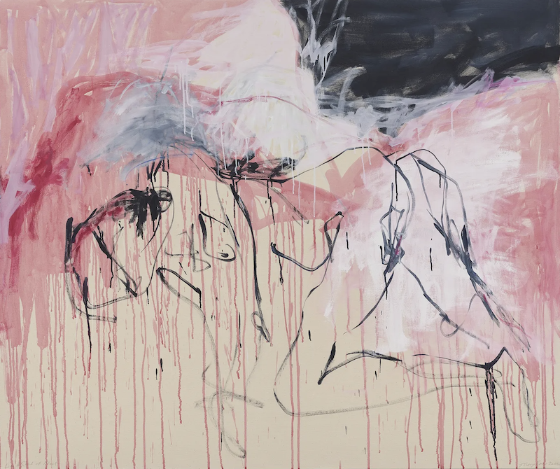
Tracey Emin’s work is powerful because it turns exposure into form.
At first, her art can seem almost too direct: beds, bodies, lovers, abortions, grief, loneliness, illness, sex, handwritten confessions, raw lines, urgent color, and emotional declarations. But the strength of Emin’s work is not simply that she reveals private pain. The strength is that she transforms vulnerability into an artistic language.
Her work asks a difficult question again and again:
How can private experience become public form without becoming merely diary, spectacle, or sentimentality?
That is the problem underneath the practice. Emin looks directly at love, desire, loss, grief, shame, solitude, illness, and survival, but the work is strongest when experience becomes structure: line, text, fabric, object, bed, body, neon, scale, absence, and gesture.
Life as Material, Not Just Biography
Emin’s work is often described as autobiographical, but that word can be misleading if it makes the art sound like a life story simply placed into a gallery.
White Cube writes that Emin “looks to her life for her primary material,” using candor to probe both the construction of the self and the impulse to create. The gallery connects her work to love, desire, loss, grief, self-portraiture, the nude, family, childhood, troubled adolescence, relationships, pregnancies, abortions, writing, neon, sculpture, film, drawing, and painting. But crucially, it says these experiences are explored in a way that is “neither tragic nor sentimental,” intersecting with her commitment to the formal disciplines of art. (White Cube)
That phrase matters: neither tragic nor sentimental.
This is what keeps Emin’s strongest work from becoming simple confession. She does not merely say, “This happened to me.” She turns what happened into an object, a mark, a room, a surface, a sentence, a trace, or a bodily atmosphere.
A weaker artist might use trauma or vulnerability as proof of depth.
Emin’s stronger move is to make vulnerability behave formally. The rawness becomes line. The grief becomes space. The bed becomes sculpture. The sentence becomes image. The body becomes mark.
A World of Exposure, Absence, and Emotional Directness
Emin has built a visual world that is instantly recognizable, even though she works across many media.
Her world includes:
handwritten text,
neon declarations,
embroidered blankets,
beds and rooms,
loose drawn bodies,
red and blue painterly marks,
white space,
sexual memory,
absence,
loneliness,
female bodily experience,
and a voice that feels exposed but controlled.
This world is not polished in the conventional sense. It often feels urgent, wounded, stripped down, and emotionally immediate. But it is not careless. The simplicity is part of the force.
White Cube notes that her choice of medium is integral to the story she tells. Her hand-embroidered blankets and quilts, associated with women’s work, combine uneven stitching, scraps of material, and uncorrected syntax to make language physically vulnerable. (White Cube)
That is the visual world: the private made material, but not cleaned up.
The work often feels as if it is close to collapse. A line barely holds a body. A sentence barely holds grief. A room barely holds memory. A bed barely holds a life. But that fragility is the point. Emin’s world is built from things that seem unable to fully protect the self.
Why the Surface Feels Charged
The pressure in Emin’s work comes from the tension between exposure and form.
The work often feels emotionally naked, but it is also composed. It risks confession, but it is not only confession. It risks sentiment, but it does not become sentimental. It risks spectacle, but it often turns spectacle back into loneliness.
Her famous installation My Bed is a clear example. White Cube describes the work as an uncensored re-presentation of her own bed during a distraught period, with objects such as slippers, condoms, cigarettes, empty bottles, and underwear accumulating around it. The gallery frames the bed as abstracted from function, placed in conversation with art history, and transformed into a stage for life events: birth, sleep, sex, depression, illness, and death. (White Cube)
That is why My Bed is not only a messy bed.
It is a portrait without a body.
A self-portrait through aftermath.
A domestic object turned into evidence.
A private collapse placed in public view.
A stage where absence becomes presence.
The pressure comes from the viewer’s discomfort. We are looking at something most people would hide. But we are also looking at a carefully framed object inside the history of art. The work implicates the viewer: are we witnessing, judging, pitying, consuming, or intruding?
The Body as Line
In Emin’s recent paintings, the body often appears through loose, urgent, almost collapsing marks. Figures are suggested rather than fully described. The body can seem wounded, dissolving, sexual, grieving, or half-remembered.
White Cube’s 2024 exhibition I followed you to the end describes new paintings and sculptures moving through love and loss, mortality and rebirth. The gallery emphasizes her expressive painterly vocabulary, with deft, impulsive strokes capturing figures “in the throes of becoming,” while carmine, ivory, deep blues, and black temper volatile physical and emotional states with contemplation and stillness. (White Cube)
That phrase — figures in the throes of becoming — is very useful.
Emin’s bodies often do not feel fixed. They feel like bodies remembered, desired, lost, mourned, or barely held together. The line does not simply outline the figure. It enacts the instability of being a body under emotional pressure.
The drawing is not weak because it is loose. The looseness is the structure.
A tighter, more anatomically resolved figure might actually weaken the work because it would make the body too stable. Emin’s bodies need to tremble, smear, bend, disappear, and return.
The Risk of Sincerity
Emin’s work risks sincerity in a way that many contemporary artists avoid.
Irony can be protective. Theory can be protective. Coolness can be protective. Even shock can be protective if it keeps the artist from appearing emotionally exposed.
Emin often refuses that protection.
Her work risks being called too much: too personal, too raw, too emotional, too direct, too confessional, too embarrassing. But that risk is also where the force comes from. The work does not hide behind taste.
White Cube quotes Emin saying, “The most beautiful thing is honesty, even if it’s really painful to look at.” (White Cube)
That honesty can be difficult because it does not arrive as refined autobiography. It arrives as evidence: stained sheets, stitched words, uneven spelling, exposed names, empty bottles, bodies drawn in red, a bed made public.
The work’s danger is that it could fail as art and collapse into confession. But when it succeeds, confession becomes form.
Why the Work Lasts
Emin’s work lasts because it holds contradiction.
It is raw and disciplined.
Personal and public.
Exposed and formal.
Vulnerable and confrontational.
Feminine and aggressive.
Tender and brutal.
Private and theatrical.
Confessional and art-historical.
Sincere and difficult to trust completely.
The viewer never gets a neutral position. You may feel moved, uncomfortable, skeptical, protective, repelled, or implicated. That instability is part of the work’s strength.
The strongest Emin works do not ask only, “What happened to the artist?”
They ask:
What do we hide?
What do we display?
What does pain look like after the body leaves the room?
How much honesty can an artwork hold?
When does vulnerability become spectacle?
When does private experience become public truth?
Those questions are larger than biography.
What Artists Can Learn from Emin
The lesson is not to make confessional art.
That would be the wrong takeaway.
The lesson is that personal material only becomes strong when it is transformed into form. Emin’s work is powerful when the line, object, surface, text, material, or space carries the emotional pressure. The biography may open the door, but the artwork has to stand on its own.
A weaker artist might think:
“I should reveal more.”
A stronger lesson would be:
“What experience, feeling, memory, or vulnerability can I transform into a visual language?”
Or even better:
“What form does this emotional pressure require?”
Emin shows that honesty is not enough by itself. Honesty has to become structure.
Closing Insight
Tracey Emin’s greatness is not that she exposes her life. It is that she turns exposure into a language of line, object, text, body, absence, and emotional risk.
What Makes Lisa Yuskavage’s Paintings So Powerful?
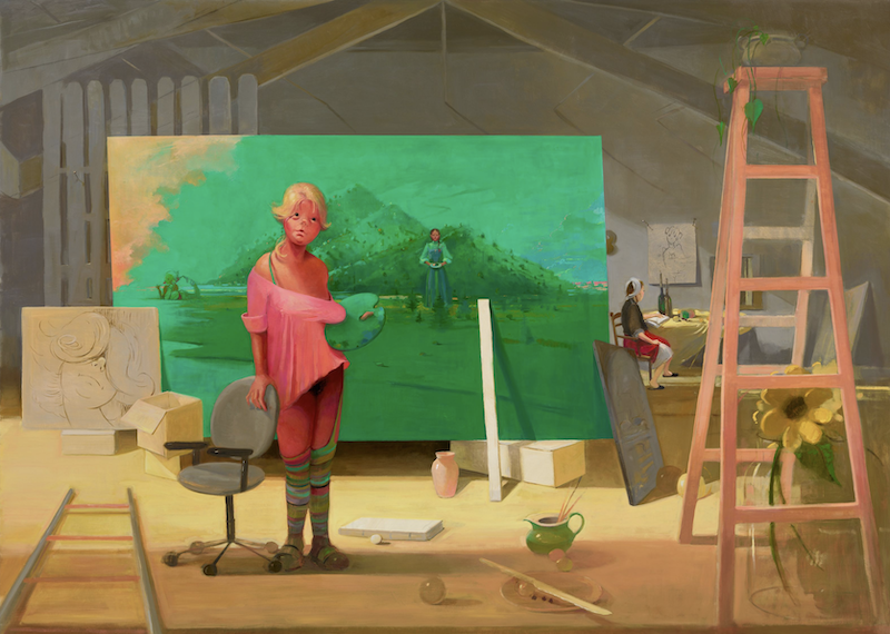
Lisa Yuskavage’s paintings are powerful because they refuse to let beauty stay innocent.
Her work is seductive, but not comfortably seductive. It is vulgar, but not merely vulgar. It is funny, but not light. It is erotic, but also awkward, wounded, theatrical, self-conscious, and strange. Yuskavage has built a world where color, desire, shame, fantasy, art history, and looking all become unstable at the same time.
What makes her work serious is not that she paints provocative women. It is that she makes the viewer feel the instability of wanting, judging, laughing, recoiling, and sympathizing all at once.
Beauty as a Dangerous Problem
Yuskavage keeps returning to one of the most difficult problems in painting:
What happens when beauty, vulgarity, desire, shame, fantasy, and art history occupy the same image?
That question has driven her work for decades. David Zwirner describes Yuskavage as one of the most original and influential painters of the past thirty years, noting that her work affirms the singularity of painting while challenging conventional ideas of genre and viewership. Her characters are described as “at once exhibitionist and introspective,” and her compositions combine representational and abstract elements, with color as the primary vehicle of meaning. (David Zwirner)
That phrase — exhibitionist and introspective — gets close to the heart of her work.
Her figures seem to show too much, but they also seem inaccessible. They are exposed, but not fully available. They can feel absurd, erotic, cartoonish, vulnerable, artificial, and self-aware. The viewer is pulled into the image, but the image does not allow the viewer to feel clean about that attraction.
This is why Yuskavage’s work cannot be reduced to erotic figuration. The deeper subject is the emotional and moral instability of looking.
A World of Color, Desire, and Unease
Yuskavage’s visual world is unmistakable.
It includes saturated color, glowing skies, theatrical interiors, strange studio spaces, doll-like bodies, exaggerated femininity, luminous flesh, acidic light, awkward poses, fantasy landscapes, art-school references, painterly atmosphere, and scenes that feel half-private and half-performed.
Her paintings often seem to belong to a world where everything is too much: the bodies, the color, the mood, the sexuality, the sweetness, the artificiality, the embarrassment. But that excess is not random. It is the climate of the work.
David Zwirner’s 2025 Los Angeles exhibition text emphasizes her fictionalized artist’s studio settings, where spaces become stages and characters from her world are intertwined. The same text highlights Christopher Bedford’s observation that color is Yuskavage’s principal tool for creating meaning — not a supporting element, but the subject’s aura and, in turn, a subject of the painting itself. (David Zwirner)
That is crucial. In Yuskavage, color does not merely beautify the image. Color creates psychological atmosphere.
Pink can feel erotic, childish, artificial, tender, or suffocating.
Green can feel toxic, pastoral, dreamy, or sickly.
Yellow can feel radiant, spiritual, cheap, or unstable.
Red can feel theatrical, sexual, violent, warm, or claustrophobic.
Her color often seduces first and unsettles second. It turns beauty into pressure.
The Viewer Is Never Neutral
One reason Yuskavage’s work has such force is that it implicates the viewer.
The viewer is not simply looking at a figure. The viewer becomes aware of looking. The work asks: What do you want from this image? Are you attracted? Amused? Embarrassed? Judgmental? Protective? Disgusted? Curious? Complicit?
David Zwirner’s 2018 press release says Yuskavage’s characters assume dual roles as both subject and object, complicating the position of viewership. It also describes them as playful and harmonious at times, rueful and conflicted at others, inside fantastical compositions where realistic and abstract elements coexist and color determines meaning. (David Zwirner)
That “dual role” matters. Her figures are looked at, but they also seem to know something about being looked at. They are objectified, but not passive. They can seem cartoonish, yet emotionally specific. They can appear ridiculous, yet strangely dignified.
A weaker artist might paint sexualized figures and produce either fantasy or critique.
Yuskavage’s stronger move is that she refuses to make the viewer’s role simple. The work does not let the viewer stand safely outside the image and declare it either empowering or exploitative, beautiful or ugly, sincere or ironic. The viewer has to sit inside the contradiction.
Painting Against Good Taste
Yuskavage’s paintings often risk bad taste.
That is part of their power.
They risk sweetness, vulgarity, sentimentality, kitsch, awkwardness, and overripe beauty. They risk being misunderstood as merely provocative or regressive. But the risk is not accidental. It belongs to the work’s deepest question.
A New Yorker review from 2011 described Yuskavage’s work as having “dangerous beauty,” noting her fusion of kitsch elements with techniques recalling Old Masters and her creation of complex, art-historical narratives inside provocative paintings. (The New Yorker)
That mixture is important. Yuskavage is not simply rejecting tradition. She is contaminating it. Old Master light, art-school figure painting, erotic fantasy, bad-girl imagery, cartoonish exaggeration, and painterly beauty all coexist in the same unstable space.
Her work asks what happens when painting’s refined traditions meet images that polite taste wants to dismiss as vulgar, embarrassing, or low.
That is why the paintings can feel so alive. They do not protect themselves with good taste.
The Studio as Theater
In recent work, Yuskavage has increasingly used the imagined studio as a stage. This is significant because it turns the process of art-making itself into part of the drama.
David Zwirner’s 2023 Paris exhibition text describes large-scale paintings set in imagined artist’s studios, saturated with jewel-like pigments. These studio spaces become stages where characters from her oeuvre are intertwined, and the exhibition title Rendez-vous suggests the way painting allows different moments in time to coexist in one space. (David Zwirner)
This makes the work more self-aware.
The studio is not just a setting. It is a theater of looking, making, modeling, posing, remembering, staging, and repeating. The figures are not only subjects. They are characters inside painting’s own history.
The studio becomes a place where the model, painter, viewer, artwork, and fantasy all meet.
Why the Work Lasts
Yuskavage’s paintings last because they do not resolve.
They hold contradiction:
beautiful and vulgar
tender and cruel
funny and sad
erotic and embarrassing
painterly and kitsch
artificial and emotionally exposed
high art and low culture
subject and object
fantasy and self-awareness
This is where her work gains interpretive stamina. The viewer cannot summarize it too easily. Every clear reading produces its opposite.
If the work is feminist, why does it seem to indulge the very imagery it critiques?
If it is erotic, why is it so awkward?
If it is vulgar, why is it so painterly and tender?
If it is funny, why does it feel so lonely?
If the figures are objectified, why do they also seem strangely inward?
These contradictions are not weaknesses. They are the engine of the work.
What Artists Can Learn from Yuskavage
The lesson is not to imitate Yuskavage’s figures, sexuality, color, or provocation.
The lesson is that beauty becomes powerful when it is allowed to become unstable.
Yuskavage shows that “bad taste” can be serious if it is transformed into pressure. Kitsch can become psychological. Vulgarity can become a way to expose the viewer’s expectations. Color can become emotional weather. Eroticism can become a trap, a performance, a wound, or a mirror.
A weaker artist might think:
“I should make my work more provocative.”
A stronger lesson would be:
“What kind of beauty am I afraid to risk? What kind of discomfort does my work need to hold without resolving?”
Yuskavage’s strongest work is not powerful because it shocks. It is powerful because it makes looking feel morally, emotionally, and aesthetically unstable.
Closing Insight
Lisa Yuskavage’s greatness is not that she paints desire. It is that she makes desire uncomfortable, funny, beautiful, vulgar, tender, and impossible to fully separate from the viewer’s own act of looking.
What Makes Jenny Saville’s Paintings So Powerful?
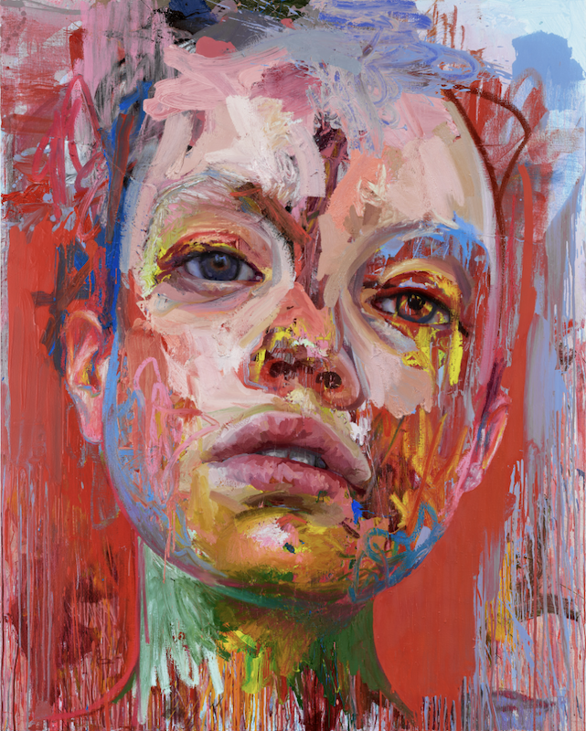
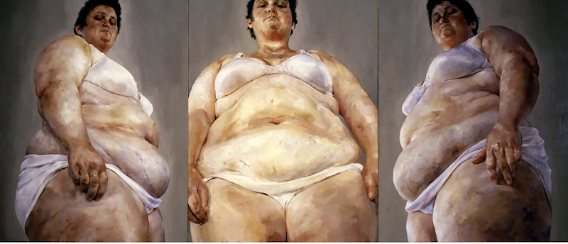
Jenny Saville’s paintings do not make the body beautiful in the conventional sense. They make the body unavoidable.
Her greatness is not simply that she paints flesh at a large scale, or that she distorts the figure, or that her surfaces are physically intense. It is that she turns flesh into a site of pressure: beauty, vulnerability, mass, gender, medical looking, art history, abstraction, and mortality all pushing against each other inside the same painted body.
Saville’s work matters because she makes figurative painting feel dangerous again. Not dangerous because it shocks, but because it refuses to let the body become clean, ideal, distant, or easily consumed.
The Body as an Unsolved Problem
Saville keeps returning to the body, but “the body” is too simple a description of what she is doing.
The deeper question in her work is something like:
What happens when flesh, paint, beauty, vulnerability, gender, medicine, and art history collide?
That question has carried her practice for decades.
Gagosian describes Saville’s early interest in the “imperfections” of flesh and the social implications and taboos attached to them. Her observation of a New York plastic surgeon in the 1990s became formative, fueling her examination of the ways flesh can be transformed and disfigured. Her sources have included medical pathologies, cadavers, animals and meat, classical and Renaissance sculpture, intertwined couples, mothers and children, and bodies that challenge gender dichotomies. (Gagosian)
That range matters. Saville is not simply painting bodies as subjects. She is studying the body as a place where culture, biology, violence, care, desire, medical intervention, and painterly tradition all converge.
The body in her work is never neutral.
It is looked at.
Handled.
Idealized.
Judged.
Reconstructed.
Exposed.
Painted.
Distorted.
Made monumental.
That is why the work has force. The body is not a theme; it is a problem she cannot exhaust.
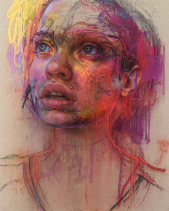
A World of Flesh and Paint
Saville’s visual world is immediately recognizable: monumental bodies, faces, folds, limbs, bruised color, thick surfaces, smeared paint, charcoal lines, fleshy pinks, reds, grays, whites, and sudden acidic marks of blue, green, yellow, or orange.
But the world is not recognizable only because of style. It is recognizable because her paint behaves like flesh.
Gagosian writes that Saville reinvigorated contemporary figurative painting by challenging the limits of the genre and raising questions about society’s perception of the body and its potential. The gallery also notes that her work reveals deep awareness of how the body has been represented across cultures and art history, from antique and Hindu sculpture to Renaissance painting, Matisse, de Kooning, Picasso, magazines, and tabloids. (Gagosian)
That mix of sources is part of her world. Saville’s paintings feel ancient and contemporary at once. They echo Titian, Rubens, Manet, and Renaissance flesh, but they also feel shaped by surgery, photography, tabloids, gender politics, and the medicalized body.
Her figures often feel too close, too large, too exposed. They crowd the picture plane. They refuse polite distance. The viewer does not look at the body from a safe art-historical remove. The viewer confronts flesh as mass, paint, image, and vulnerability.
That is the visual world: not the body idealized, but the body made present.
Flesh Under Pressure
The pressure in Saville’s paintings comes from contradiction.
The figures can be beautiful and abject.
Monumental and vulnerable.
Classical and contemporary.
Painterly and bodily.
Sensual and medical.
Exposed and authoritative.
Human and almost sculptural.
This is why the work does not collapse into a single message. It is not simply feminist critique, body positivity, grotesque realism, painterly bravura, or art-historical revision. It holds all of those pressures at once.
National Galleries of Scotland describes Saville’s paintings as distorting accepted representations of the body, noting that she gained international recognition with uncompromising, large-scale paintings of female nudes and later deepened her interest in flesh through observing plastic surgery and working with transgender models. (National Galleries of Scotland)
That phrase — distorting accepted representations of the body — gets close to the heart of the work.
Saville does not distort the body merely to make it expressive. Distortion becomes a way of challenging inherited expectations about what bodies should look like, how they should be seen, and who gets to control their image.
The pressure is not only in the subject. It is in the paint itself.
The paint smears, thickens, slips, builds, bruises, and opens. It can feel like skin, wound, muscle, fat, makeup, scar, or surface all at once. The body is not calmly described; it is materially enacted.
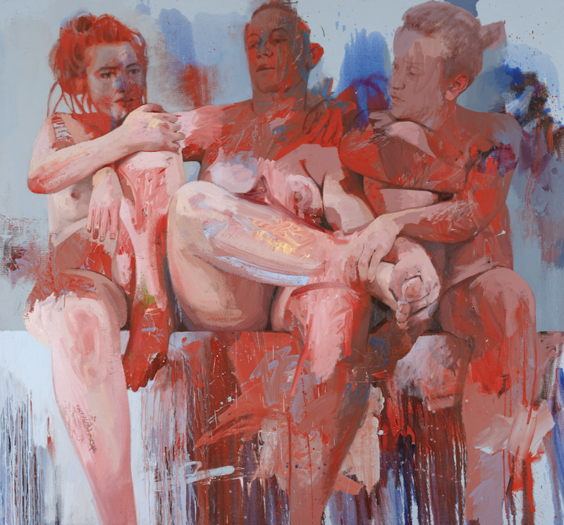
Scale as Confrontation
Saville’s scale is not just impressive. It is necessary.
The large scale changes the viewer’s relationship to the body. A smaller painting might allow the figure to become an image. Saville’s scale makes the body into an encounter.
The viewer does not simply observe. The viewer is physically addressed.
This is one reason her work is often weaker in reproduction than in person. On a screen, the body becomes an image again. In the gallery, the body becomes a presence.
That is also why the paintings can feel uncomfortable. They do not let the viewer maintain full control. The body is larger than the viewer expects, closer than the viewer may want, and more material than the viewer can easily aestheticize.
The scale gives the body authority.
It says: this body will not shrink itself for your comfort.
Beauty Without Idealization
One of the most interesting things about Saville is that her work keeps returning to beauty, but not ideal beauty.
A recent Financial Times profile summarizes Saville as combining beauty with raw and often unsettling imagery, while noting her continued exploration of flesh, gender, identity, realism, abstraction, and the movement of paint. (Financial Times)
This is important because Saville is not anti-beauty. Her color can be gorgeous. Her surfaces can be seductive. Her drawing can be astonishing. Her faces can be tender. But beauty in her work is always under pressure.
It does not erase vulnerability.
It does not smooth the body into fantasy.
It does not protect the viewer from discomfort.
It does not turn flesh into an ideal.
Instead, beauty and difficulty coexist.
That coexistence is one reason her paintings last. If they were only ugly, they would resolve too quickly. If they were only beautiful, they might become decorative. Saville’s power comes from refusing to let either side win.
When the Body Becomes History Painting
Saville’s Aleppo is especially useful because it shows how her body-problem can expand beyond the nude into contemporary suffering and historical grief.
National Galleries of Scotland describes Aleppo as a pastel and charcoal work in which a stone-like form holds cradled bodies, recalling the Pietà. The museum notes that although Saville had created paintings linked to war before, Aleppo was her first work to refer directly to a contemporary conflict: the Syrian civil war and its impact on civilians. (National Galleries of Scotland)
This shows how her practice can stretch without losing its core. The work is still about bodies, but now the body becomes collective, historical, civilian, wounded, and mourned.
The reference to the Pietà matters because it brings art history into contact with contemporary violence. The cradled body is not only a religious image. It becomes a form for grief that repeats across time.
Saville’s body is never only anatomical. It is historical.
What Artists Can Learn from Saville
The lesson is not to paint flesh like Jenny Saville.
The lesson is to make the material behave like the subject.
In Saville’s strongest work, paint does not describe the body from a distance. Paint becomes bodily. Scale does not merely impress. It confronts. Distortion does not merely stylize. It reveals pressure. Beauty does not merely please. It becomes unstable.
A weaker artist might think:
“I should make my figures larger, rougher, or more distorted.”
A stronger lesson would be:
“What does my subject require from the material? What must the surface do that the image alone cannot do?”
That is the real insight.
Saville shows that a painting becomes powerful when its formal choices are inseparable from its deepest question. Flesh is not just what she paints. Flesh is the pressure through which the whole painting thinks.
Closing Insight
Jenny Saville’s greatness is not that she paints the body with force. It is that she makes flesh, paint, scale, beauty, and vulnerability become the same problem.
What Makes Julie Mehretu’s Abstraction So Powerful?
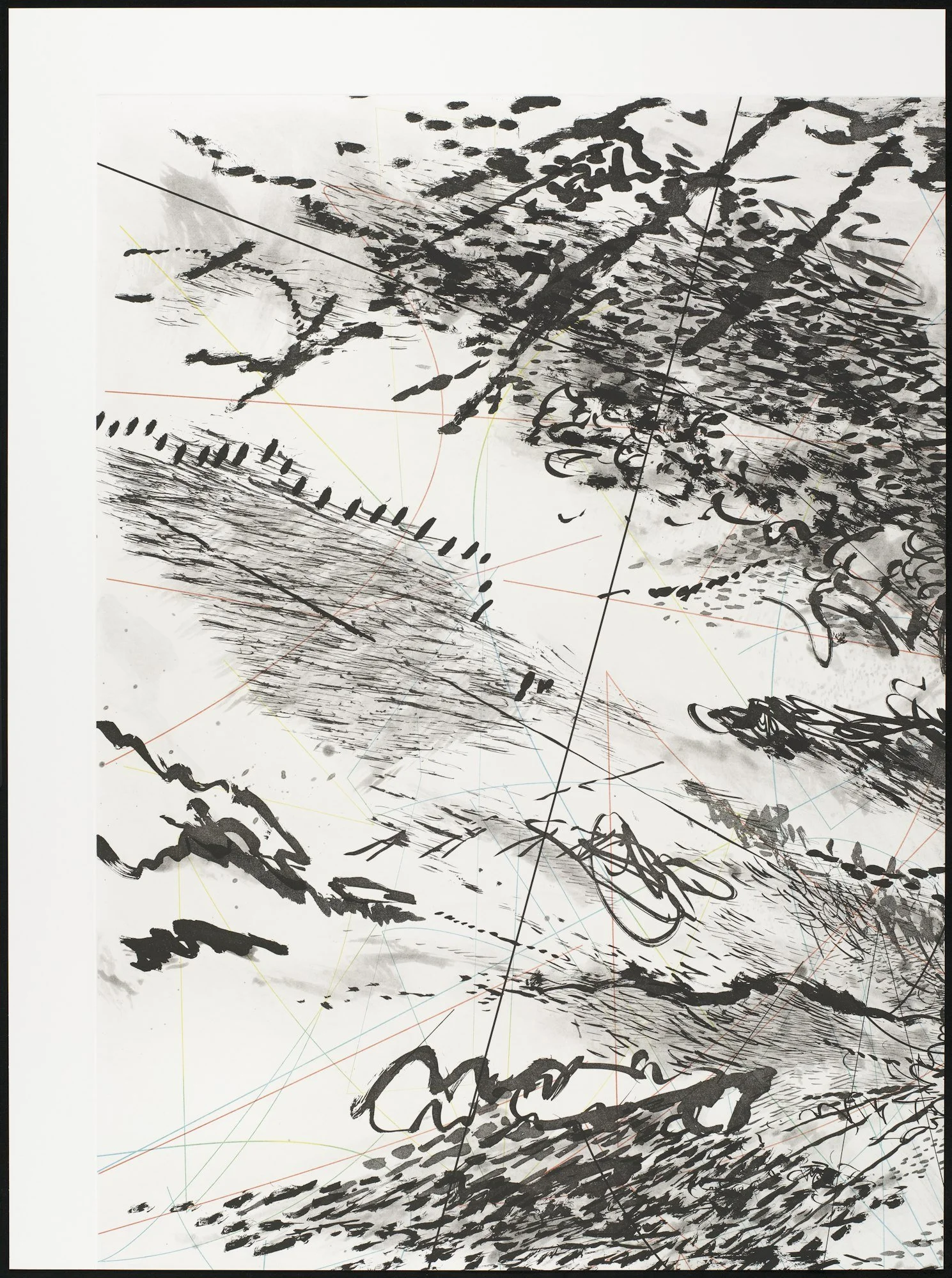
Julie Mehretu’s paintings are not powerful simply because they are large, dense, or visually energetic. They are powerful because they turn history, architecture, movement, and political instability into a world of marks. Her abstractions feel like maps of a world that cannot settle: public space breaking apart, histories accumulating, cities becoming psychological fields, and drawing becoming a form of pressure.
What makes Mehretu important is not that she found a dynamic style. It is that she found a way to make abstraction carry the experience of contemporary life.
Painting a World in Motion
At first glance, Mehretu’s paintings often feel like storms of line, gesture, color, architecture, and erasure. They can look cartographic, urban, aerial, explosive, calligraphic, or atmospheric. But the longer you look, the less stable they become. Are these maps? Cities? Ruins? Crowds? Protests? Weather systems? Histories? Psychological states?
That instability is central to the work.
White Cube describes Mehretu’s practice as one where ideas of time, space, and place are deeply enmeshed. Drawing is fundamental to her work, and her mark-making becomes a response to social and political change. The gallery also emphasizes her use of smudging, erasure, overwriting, ink, paint, and transparent layers to visualize the accumulation of history and register her own response to it. (White Cube)
This is why the paintings do not feel like decorative abstraction. The marks are not only marks. They behave like forces: movement, pressure, interruption, collapse, direction, protest, disappearance, and return.
A weaker artist might imitate Mehretu’s density and produce visual excitement. Mehretu’s stronger move is that density becomes a model of contemporary experience. The paintings feel unstable because the world they are registering is unstable.
The Problem Beneath the Paintings
Mehretu’s work keeps returning to a profound question:
How can abstraction register history, migration, architecture, political upheaval, and the experience of living inside unstable public space?
That question gives the work its force.
Her paintings are not literal history paintings in the old sense. They do not show a single event with figures arranged in a narrative scene. Instead, they absorb the conditions around events: architecture, movement, protest, collapse, social pressure, erased information, and competing systems of order.
White Cube notes that Mehretu’s early imagery had a cartographic quality and that she thought of some drawings as indexes of “migration, settlement, and even extinction.” The gallery also describes her use of architectural plans as underlayers and her combination of aerial, cross-sectional, curvilinear, and isometric perspectives, which invite the viewer to navigate the painting from different viewpoints. (White Cube)
That is important. Mehretu is not just making expressive abstraction. She is building paintings that feel navigable, but never fully knowable. The viewer enters the work as if entering a system: part map, part city, part archive, part political weather.
The painting becomes a way to think about how people move through history without ever seeing the whole structure clearly.
A Visual World You Can Recognize
Mehretu has built one of the most recognizable visual worlds in contemporary painting.
Her world includes:
architectural underdrawing,
transparent layers,
smudges and erasures,
calligraphic marks,
fragments of maps and plans,
bursts of color,
gestural velocity,
crowded visual fields,
shifting perspectives,
and the feeling of history in motion.
The work can change scale, palette, density, or mood, but the intelligence remains recognizable. You feel the same mind organizing the chaos.
White Cube describes one painting, Insile, as a “vertiginous, architectonic composition” where aerial, cross-sectional, and isometric perspectives come together inside a dense network of visual incident. The same text describes Mehretu’s method as a layering of architectural drawing and intuitive abstract gestures, including geometric pixelation, dynamic lines, and feathered brushwork. (White Cube)
That combination is the world.
Architecture gives the paintings structure.
Gesture gives them agency.
Erasure gives them history.
Layering gives them time.
Color gives them atmosphere.
Scale gives them bodily force.
The result is not a style pasted onto abstraction. It is a visual language for a world under pressure.
Why the Surface Feels Charged
Mehretu’s surfaces are alive because they hold competing forces.
There is order and disorder.
Architecture and collapse.
Map and storm.
Control and eruption.
History and immediacy.
Public space and private response.
Structure and movement.
Accumulation and erasure.
This is why the paintings reward sustained looking. From a distance, they may feel like vast energetic fields. Up close, they become full of incidents: tiny marks, partial systems, interrupted lines, blurred grounds, disappearing structures, and sudden flashes of color.
White Cube’s discussion of Insile says the painting warrants close and prolonged study but also demands that the viewer step back to absorb the whole. The gallery frames the work in relation to politics, architecture, history, and collective social identity, while also quoting Mehretu on wanting looking to become a physical experience. (White Cube)
That movement between close looking and distance is essential.
You cannot understand a Mehretu painting from one position. You have to move mentally and physically. You look close, then step back. You find structure, then lose it. You follow a line, then it dissolves. You think you are seeing a map, then the painting becomes weather.
That is where the pressure lives.
Abstraction as History Painting
One of the strongest ways to understand Mehretu is as a contemporary history painter.
Not because she illustrates history, but because she paints the forces through which history is experienced now: migration, conflict, architecture, crisis, protest, speed, media, and social transformation.
White Cube’s text on Insile explicitly positions Mehretu as a contemporary master of a new kind of history painting, connecting her dynamic mark-making to the complexity and interconnectedness of the twenty-first century. (White Cube)
That phrase matters: a new kind of history painting.
Traditional history painting often organized the world into legible drama: heroes, events, bodies, symbols, moral lessons. Mehretu’s paintings suggest that history no longer feels so stable. It arrives as fragments, plans, images, ruins, movements, systems, protests, and traces. It is not one scene. It is an accumulation.
Her abstraction feels contemporary because it understands the pressure of the present without simply illustrating it.
What Artists Can Learn from Mehretu
The lesson is not to imitate Mehretu’s marks.
That would miss the point.
The lesson is that formal complexity becomes powerful only when it answers to a deeper pressure. Mehretu’s lines, layers, erasures, and architectural fragments matter because they are part of a larger investigation into time, space, history, agency, and political transformation.
A weaker artist might think:
“I should make my paintings more layered.”
A stronger lesson would be:
“What kind of world requires layering? What kind of experience cannot be shown through a single surface, single image, or single viewpoint?”
That is the real takeaway.
Mehretu shows that abstraction does not have to withdraw from the world. It can absorb the world’s instability and give it form.
Closing Insight
Julie Mehretu’s greatness is not that she makes abstraction look alive. It is that she makes abstraction think historically, move politically, and feel like the unstable atmosphere of the present.
Pablo Picasso – Femme au béret bleu assise dans un fauteuil gris, manches rouges (1937)

In this quietly complex portrait, Pablo Picasso renders Dora Maar—his lover, muse, and one of the most intellectually formidable women in his life. Painted in 1937, Femme au béret bleu assise dans un fauteuil gris, manches rouges (translated: Woman in a Blue Beret Seated in a Gray Armchair, Red Sleeves) is a moment of psychological stillness just before the emotional volatility of his Weeping Woman series takes over.
Here, Dora is both composed and fractured: her face split into dual angles—profile and frontal—characteristic of Picasso’s late Cubist phase. But unlike earlier Cubist portraits that reveled in fragmentation, this work breathes with a more emotional restraint. Its flattened planes feel almost architectural, constructed from pastel blocks of lavender, sage, and crimson. Her beret and garment details are stylized into costume-like symbols of identity, perhaps referencing her Parisian surrealist roots.
The composition subtly frames her within a painted "window," suggesting not just containment, but introspection. This is Dora not as the anguished muse of later paintings, but as a poised, enigmatic presence—calm before the storm.
I’m drawn to how the painting balances opposites: softness and structure, calm and tension, intimacy and distance.
Artwork Details
Artist: Pablo Picasso
Title: Femme au béret bleu assise dans un fauteuil gris, manches rouges
Year: 1937
Medium: Oil on canvas
Dimensions: 100 × 80 cm (39 3/8 × 31 1/2 inches)
Muse: Dora Maar
Source: © 2025 Estate of Pablo Picasso / ARS, New York. Photo: Sandra Pointet
📍 Currently on view at Gagosian New York:
Picasso: Tête‑à‑tête (Apr 18 – Jul 3, 2025)
A Journey into the Wild World of Michael Armitage

Forget your beige gallery walls and predictable nudes – Michael Armitage's paintings are a trip to another planet, where East African myths tangle with Western art history in a kaleidoscope of color and captivating narratives. Let's ditch the stuffy critic jargon and dive headfirst into why this Kenyan-born artist is redefining the game.
East Meets West, Bark Meets Brush
Imagine, if you will, a Renaissance painting done on Lubugo bark cloth, a traditional Ugandan material. That's Armitage's signature move. He blends his European art training with vibrant East African aesthetics, creating a visual language that's both familiar and utterly fresh. Think Masai warriors painted with the precision of a Michelangelo, or lush landscapes teeming with fantastical creatures ripped straight from Kenyan folklore.

Why the Fuss? A Feast for the Eyes and the Mind
Armitage's work isn't just visually stunning; it's a treasure trove of meaning waiting to be unraveled. His paintings tackle the complexities of postcolonial Africa, weaving social commentary, political satire, and personal memories into his dreamlike scenes. We're talking environmental anxieties, political unrest, and the beauty and brutality of nature, all swirling together in a symphony of oil paint.
But Wait, There's More!: Decoding the Armitage Code
Don't expect a neat explanation on a plaque beside the painting. Armitage's narratives are layered and ambiguous, inviting multiple interpretations. He throws in references to Western mythology, Kenyan proverbs, and even pop culture, making each viewing a thrilling detective story. The joy is in the journey, not just the destination.

So, How Can You Crack the Code?
As you delve deeper into Armitage's world, questions will inevitably arise. How does his use of Lubugo bark cloth influence the meaning of his work? How do his paintings reflect the political climate in Kenya? Is there a connection between his hybrid creatures and the concept of postcolonial identity? These are just a few rabbit holes you can tumble down on your Armitage adventure.
Armitage himself says, "I want people to bring their own stories to the work." The best way to approach his art is with an open mind and a curious spirit. Let the imagery wash over you, notice the recurring symbols and motifs, and don't be afraid to ask questions. There are no wrong answers here, just the thrill of discovery.
Michael Armitage isn't just painting pictures; he's building universes. His work is a mind-bending blend of beauty, brains, and bold experimentation. So prepare to be transported to a world where lions wear crowns, politicians morph into birds, and every brushstroke tells a story. Just remember, bring your curiosity, leave your expectations at the door, and enjoy the ride!
Philip Guston: The Maverick of Modern Art

Hello art enthusiasts! Today, let's dive into the intriguing world of Philip Guston, a name that resounds with rebellion, innovation, and a dash of controversy in the modern art scene. Why do I say that? Well, buckle up, as we explore the life, art, and the unique legacy of this extraordinary artist.
A Rebel with a Cause: Why Guston Matters
Philip Guston, originally born Philip Goldstein, was an enigma. He started off in the realm of abstract expressionism, rubbing shoulders with giants like Jackson Pollock and Willem de Kooning. But here’s the twist: when the art world was swooning over abstract art, Guston did the unthinkable – he shifted back to figurative painting. This move was seen as a betrayal by many of his contemporaries, but Guston didn’t flinch. Why is he important? Because he dared to defy the norms of his time, showcasing that true art is not about following trends but about following one’s vision and voice.

The Guston Effect: Engaging the Viewer
What makes Guston's work a feast for the senses? It's his bold use of cartoonish figures, a vibrant yet often dark palette, and a playful yet profound commentary on the human condition. His later works, full of hooded figures, objects like shoes, and clocks, are not just paintings; they are stories waiting to be deciphered. They engage the viewer, inviting them into a dialogue, a characteristic that makes his work timeless and continually relevant.
Each piece is a blend of personal narrative and social commentary. In Guston’s world, art is not just to be seen; it’s to be experienced, to be questioned. This approach sets him apart from many of his contemporaries who often leaned towards more abstract representations.

Interpreting Guston: Beyond the Canvas
So, how should one approach Guston’s art? Think of his paintings as visual poetry. Every element on the canvas, be it a shoe, a book, or a hand, is a metaphor open to interpretation. Guston's shift from abstract to figurative art was not just a change in style but a philosophical statement - a call to confront and engage with the tangible, the real.
His paintings, especially post-1960s, are a window into his inner thoughts and societal observations. To fully appreciate Guston, one must abandon the search for concrete meanings and instead embrace the ambiguity and multi-layered narratives his work offers.

Unveiling the Brilliance of Esaí Alfredo

Hello, art enthusiasts! Today, I'm thrilled to introduce you to an artist who is painting the art world in vibrant new colors: Esaí Alfredo. Esaí's work is not just a display of talent; it's a journey into a world where creativity knows no bounds. So, why is Esaí Alfredo turning heads in the art community? The answer lies in his unique approach to storytelling through art.
Esaí's artistry stands out for its deep emotional resonance and its ability to connect with the viewer on a personal level. His paintings are more than mere images; they are stories told in colors and shapes, each piece a chapter of a larger narrative. This emotional depth is what makes Esaí's work not just interesting but captivating.

A New Perspective in Art
What sets Esaí apart from his contemporaries? It's his fearless exploration of themes that are both personal and universal. Esaí doesn't just paint landscapes or portraits; he captures emotions, dreams, and the essence of human experiences. His work is a blend of the surreal and the real, creating a space where the viewer can lose themselves and find themselves at the same time.
Interpreting Esaí's work requires an open mind and heart. Each piece invites the viewer to dive into a story, to explore the layers of meaning, and to connect with the emotions portrayed. It's an interactive experience, where the art speaks and the viewer listens, creating a personal dialogue.
Final Thoughts: The Enigmatic Art of Esaí Alfredo
To fully appreciate Esaí Alfredo's art, one must engage with it beyond the surface level. His work is a testament to the power of art to evoke emotions, tell stories, and connect with people. Esaí's journey as an artist is one of continual growth and exploration, and it's a journey worth following.

Twisted Visions and Fractured Forms: A Dive into the World of George Condo

George Condo isn't your average artist. This contemporary art icon creates works that are a kaleidoscope of fragmented faces, distorted figures, and bold, expressive colors. But beyond the initial shock factor lies a deeper meaning, a commentary on the human condition and the fractured nature of reality. So, why should you care about George Condo? Buckle up, art enthusiasts, because we're about to take a trip through his twisted yet captivating world.
Deconstructing the Human Form: Why Condo's Work Matters
Condo's work isn't just about making people squirm. It's a deliberate exploration of the human psyche, our anxieties, and the masks we wear in society. His distorted figures, often reminiscent of Picasso, are more than just stylistic choices. They represent the fragmented nature of our identities, the internal struggles we face, and the ever-shifting definition of beauty.
But it's not all dark and gloomy. Condo's work also possesses a vibrant energy, a playful humor that shines through the distorted forms. He challenges our perception of art, pushing boundaries and reminding us that beauty can be found in the unexpected, the grotesque, and even the unsettling.

A World Apart: What Makes Condo Stand Out
In a world saturated with art, it's hard to make a lasting impression. But Condo manages to do just that. His unique style, blending influences from Cubism, Pop Art, and Expressionism, creates a visual language all his own. His masterful use of color and texture adds another layer of depth, drawing the viewer into the emotional landscape of his work.
But perhaps the most defining element of Condo's art is its sheer audacity. He embraces the uncomfortable, the grotesque, and the unsettling, forcing us to confront our own inner demons and preconceived notions of beauty. In a world that often seeks to sanitize and simplify, Condo's work is a refreshing reminder of the complexity and contradictions that lie within us all.

Decoding the Enigmas: How to Read Condo's Work
Condo's work isn't a straightforward narrative. It's a series of cryptic puzzles, inviting the viewer to decipher the hidden meanings and emotions behind the distorted figures and fractured forms. He draws inspiration from a range of sources, from art history to pop culture, creating a layered dialogue that rewards attentive observation and critical thinking.
There's no single "correct" interpretation of Condo's work. Instead, he encourages viewers to engage in a personal dialogue with the art, to bring their own experiences and perspectives to the table. It's a journey of self-discovery, prompting us to question our own perceptions and explore the depths of the human psyche.

The Enigmatic Genius of Gerhard Richter: A Peek into His Mind-Bending Art

Ever seen a painting so real it could fool your eyes? That's the magic of Gerhard Richter, a German artist who's been bending minds with his photorealistic and abstract masterpieces for over 60 years.
Why is he such a big deal? Well, Richter isn't afraid to explore the blurry line between reality and illusion. He takes everyday objects and landscapes, paints them with photographic accuracy, then throws in a healthy dose of ambiguity. This leaves you questioning everything you see, like "Is that a real photo or a painting?" It's like a magic trick for your eyes and mind.

But it's not just about tricking us. Richter's work is a conversation starter. He makes us ask questions about memory, perception, and the very nature of art. He forces us to confront the limitations of our senses and the subjectivity of experience.
What's even cooler is that Richter isn't afraid to experiment. He switches between styles like a chameleon, from ultra-realistic portraits to abstract color explosions. This makes his work incredibly diverse and keeps things fresh. It's like visiting a whole museum in one artist's studio!

So, how do you "get" Richter's art? There's no one answer. Part of the fun is uncovering your own interpretation. But here's a tip: don't overthink it. Just let your eyes and mind wander, and see where the journey takes you. You might be surprised by what you discover.
Now, some might say Richter's work is a bit too intellectual or even cold. But I say it's refreshing. He doesn't spoon-feed you emotions; he invites you to participate in the creation of meaning. It's an active, engaging experience, not a passive one.

One thing's for sure: Gerhard Richter is a force to be reckoned with. He's pushed the boundaries of art and challenged our perceptions for decades. And with his playful spirit and relentless curiosity, he'll continue to mesmerize and provoke for years to come.
Still curious about Richter? Go check out his work online or visit a museum exhibit. You might just find yourself captivated by the enigmatic genius of this modern master.


Ryan Gander: The Artist Who Makes You Think... and Question Everything!

Picture this: you're walking through an art gallery, surrounded by canvases filled with colorful landscapes and portraits. Then, you stumble upon a room that's completely different. There's a stack of blank notebooks, a coat rack with identical black coats, and a sculpture that looks like a giant paper clip. This, my friends, is the world of Ryan Gander.
Gander isn't your typical artist. He's a conceptual artist, which means his work is more about ideas and experiences than about creating beautiful images. He uses everyday objects, text, and even silence to create pieces that make you think, laugh, and question everything you thought you knew about art.

More Than Just Paint and Canvas
Gander isn't your typical artist. He doesn't confine himself to a single medium. Instead, he's a playful explorer, venturing into the realms of sculpture, film, writing, even clothing. His work is a kaleidoscope of ideas, bouncing between humor, philosophy, and a healthy dose of the absurd.

A Master of Storytelling
One of the things that makes Gander so unique is his talent for weaving narratives. His pieces aren't just objects or images; they're stories waiting to be unraveled. He uses everyday objects and situations in unexpected ways, inviting us to question our assumptions about the world around us.
But what really sets Gander apart is his ability to make you think. He often uses everyday objects and situations to explore complex ideas about time, memory, and perception, leaving you with more questions than answers. And that's kind of the point! Gander wants you to engage with his work, to challenge your assumptions and see the world in a new light.

Now, how do you even begin to interpret Gander's work?
Don't worry, there's no right or wrong answer. Gander himself encourages multiple interpretations, believing that the meaning of art lies in the individual experience. So, bring your own perspective, your own questions, and let the artwork speak to you personally.

Alejandro Piñeiro Bello: A Carnival of Colors and Caribbean Tales

Meet the maestro of Caribbean mystique, Alejandro Piñeiro Bello, a contemporary artist born in Havana, Cuba, whose canvases sing the vibrant saga of the Caribbean diaspora. Bello's artistic journey is a dance between tradition and modernity, a spectacle where sociocultural narratives unfold in a riot of colors.
A Palette as Bold as the Caribbean
Bello's chosen medium is as traditional as it gets: oil on raw linen or burlap. Yet, within this classical framework, he weaves a contemporary tale that transcends time. His paintings are a riot of striking colors—hues that leap off the canvas, creating a symphony of contrasts against a backdrop of deep beige. The result? Endless landscapes and folkloric gestures that breathe with life.

A Journey Through Caribbean Memory
Trained at The National Academy of Fine Arts San Alejandro in Havana, Piñeiro Bello's artistic pilgrimage is richly adorned with accolades. Grants from The Shelley and Donald Rubin Foundation and The Rockefeller Brothers Fund in collaboration with Pioneer Works attest to his talent. A resident at the Vermont Studio Center in 2022, Bello's works find homes in prestigious collections, from The Rubell Museum in Miami to The Leeum Museum of Art in Seoul.
As you step into the world of Alejandro Piñeiro Bello, be prepared for a visual carnival where every stroke tells a story, and every color whispers a tale of the Caribbean's vibrant soul. It's not just art; it's a celebration, an immersion into the pulsating heart of a culture painted with the brush of a modern master.

A Pop Star of Art: Unveiling the Boldness of Tom Wesselmann

Tom Wesselmann, a name synonymous with vibrant colors, bold lines, and a playful exploration of everyday objects, was a Pop Art titan who shook the art world in the 1960s. But beyond the surface level, Wesselmann's work held deeper meanings, questioning societal norms and challenging conventional perspectives.
A Pop Art Pioneer
Born in Cincinnati in 1931, Wesselmann emerged alongside Andy Warhol and Roy Lichtenstein as a key figure in the Pop Art movement. He found inspiration in the mundane, turning everyday objects like cigarettes, lipsticks, and bathtubs into monumental works of art. His signature style, characterized by bold outlines, flat colors, and fragmented forms, reflected the influence of advertising and comic strips, seamlessly blending high art with popular culture.
Beyond the Obvious: A Deeper Look
While Wesselmann's work might initially appear playful and straightforward, it often carried deeper layers of meaning. His recurring themes of nudes and still lifes, for instance, challenged traditional representations of the female body and questioned conventional notions of beauty. His use of fragmented forms and partial views further invited viewers to engage with the artwork and construct their own narratives.

A Master of Many Mediums
Wesselmann wasn't confined to a single medium. He effortlessly traversed painting, collage, sculpture, and even printmaking, constantly pushing boundaries and exploring new avenues of expression. His sculptures, often featuring enlarged forms of his iconic subjects, brought his work into the three-dimensional realm, further immersing viewers in his vibrant world.
Standing Out from the Crowd
Among the Pop Art titans, Wesselmann stood out for his unique approach to subject matter. While others focused on consumer products and mass media, Wesselmann delved into more personal territory, exploring themes of intimacy, sexuality, and the human experience. He injected a sense of humor and sensuality into his work, making it both relatable and captivating.
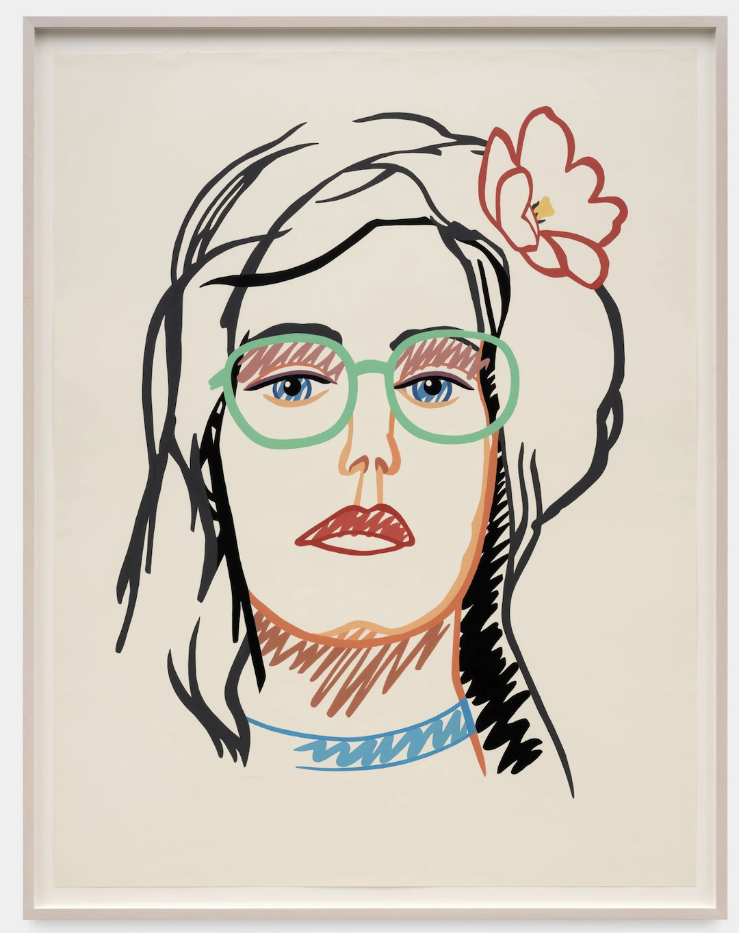
Why You Should Care
Wesselmann's work is more than just aesthetically pleasing; it's a reflection of our times, a conversation about gender roles, societal expectations, and the ever-changing nature of our visual landscape. By embracing the everyday and challenging traditional norms, Wesselmann encouraged viewers to look at the world with fresh eyes and question their own perceptions.
The Value of Wesselmann
Wesselmann's legacy extends far beyond his lifetime. His bold and innovative approach continues to inspire contemporary artists and challenge our understanding of art. His work serves as a reminder that art can be both beautiful and thought-provoking, engaging with our daily lives and prompting us to think critically about the world around us.

Jamian Juliano-Villani: Painting with Pop's Punch and Trauma's Tenderness

Get ready for a rollercoaster ride through the mind of Jamian Juliano-Villani, a rising star in the art world whose work is anything but tame. Juliano-Villani's paintings are like visual candy: bright, bold, and bursting with energy. But beneath the surface, they delve into the depths of human experience, exploring themes of humor, sexuality, and even trauma.
A Collision of Pop and Personal
Imagine Andy Warhol on a bender with Frida Kahlo, and you might get a glimpse into the world of Juliano-Villani. Her paintings are a vibrant collage of pop culture references, from memes and movie stills to fashion magazines and art history. This playful appropriation of imagery creates a sense of familiarity and immediacy, drawing the viewer into the artist's vibrant world.
But don't be fooled by the surface-level fun. Juliano-Villani's work often juxtaposes humor with a darker undercurrent. Grotesque figures emerge from candy-colored landscapes, and scenes of joy are tinged with a sense of unease. This push and pull between light and dark is what makes her work so captivating and thought-provoking.

Interpreting the Chaos: A Dive into the Subconscious
Juliano-Villani's paintings are like dreamscapes, bursting with symbolism and open to multiple interpretations. There are no easy answers here, no clear narratives to follow. Instead, the artist invites us to engage in a dialogue with her work, to explore our own emotions and memories as we navigate the chaotic landscapes she creates.

Why Should We Care?
Juliano-Villani's work is important because it challenges us to look beyond the surface of pop culture and confront the complex realities that lie beneath. It forces us to confront our own vulnerabilities and to question the assumptions we hold about the world around us. In a world saturated with images and information, her work serves as a much-needed reminder to look deeper and to engage with the world in a more critical and thoughtful way.

Finding Meaning in the Mayhem
Juliano-Villani's work is a reminder that life is messy and complex, filled with both joy and pain. Her paintings are not meant to provide easy answers, but rather to provoke thought and reflection. By immersing ourselves in these chaotic landscapes, we come face-to-face with our own vulnerabilities and gain a deeper understanding of the human condition.


Diving into the Vibrant World of Katherine Bradford: Where Representation and Metaphor Meet

Katherine Bradford's vibrant canvases, bursting with color and movement, invite viewers on a journey into a world that's simultaneously familiar and fantastical. Imagine diving into a pool of light, or witnessing a ballet of figures swirling through a kaleidoscope of emotions. That's the magic Bradford conjures with her brushstrokes.
In a world saturated with images, Bradford's work stands out for its originality and depth. She challenges our perception of reality, inviting us to contemplate the human form, our relationship with nature, and the very essence of art itself. By blurring the lines between representation and abstraction, she creates a space for personal interpretations and emotional connections, making her art both intellectually stimulating and deeply moving.
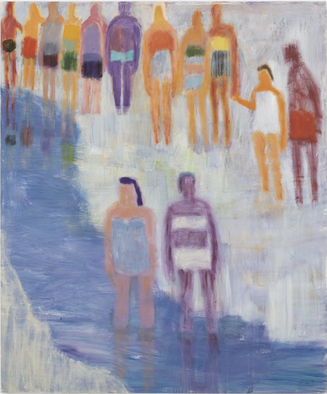
More than Just Swimmers:
While Bradford's iconic paintings often feature swimmers, their essence goes far beyond a simple depiction of people in water. These figures become metaphors, embodying emotions and narratives that resonate with viewers on a deeper level. Her paintings are populated by figures – swimmers, dancers, even the occasional flying woman – but these figures are not mere portraits. Rather, they serve as metaphors for the human condition, capturing the essence of joy, sorrow, and everything in between.


Why You Should Care About Katherine Bradford:
1. A Refreshing Take on Figurative Art: Bradford's commitment to figurative painting is both refreshing and captivating. Her brushstrokes are alive with energy and emotion, drawing viewers into the narratives unfolding on her canvases.
2. A Master of Color and Composition: Bradford's palette is a feast for the senses, with vibrant hues seamlessly blending together to create a sense of depth and movement. And her compositions are meticulously crafted, drawing the eye through the various elements of her paintings with a sense of balance and harmony.
3. A Gateway to Self-Discovery: Beyond the aesthetic beauty, Bradford's works offer a platform for self-exploration. By contemplating the figures and scenes she depicts, viewers are invited to reflect on their own experiences, emotions, and place in the world.
Whether you're a seasoned art enthusiast or simply someone who appreciates beauty and emotional depth, Katherine Bradford's work is an experience worth having. So, take a deep breath, plunge into the vibrant world she creates, and let her art transport you to a place where the ordinary becomes extraordinary.
