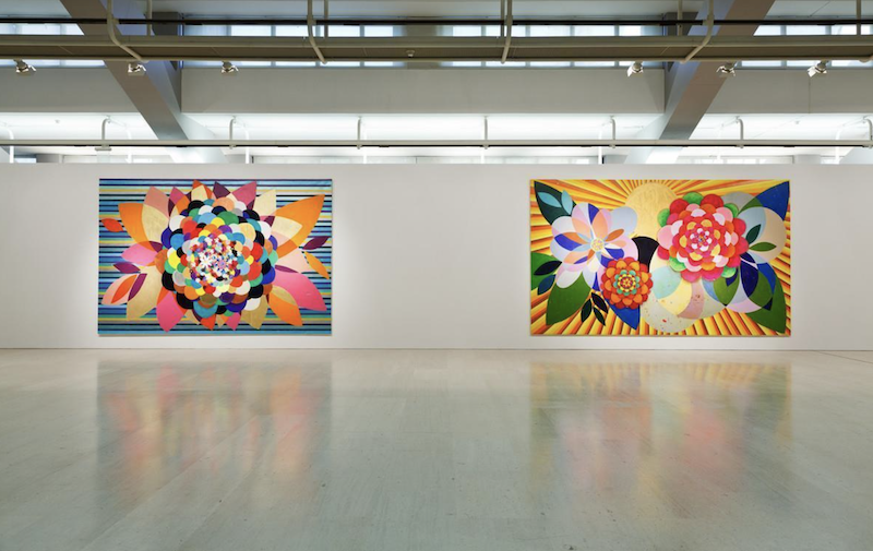
What Makes Beatriz Milhazes’s Paintings So Powerful?
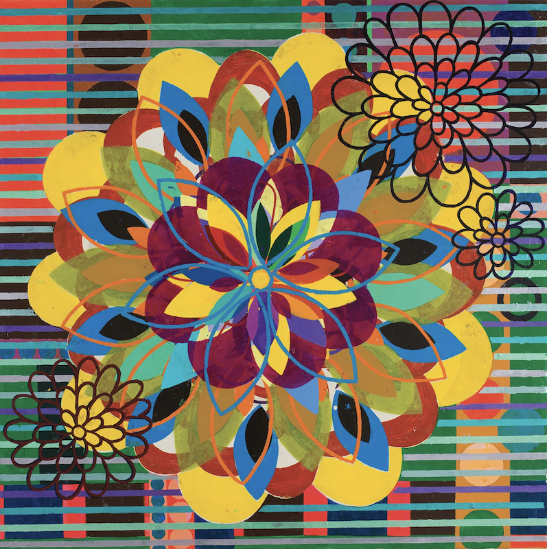
Beatriz Milhazes’s paintings are powerful because they turn decoration into a rigorous system where beauty, cultural memory, geometry, nature, and visual excess struggle for control.
At first, the paintings can appear immediately joyful.
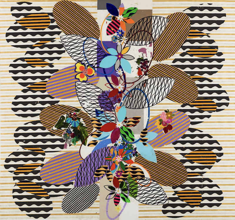
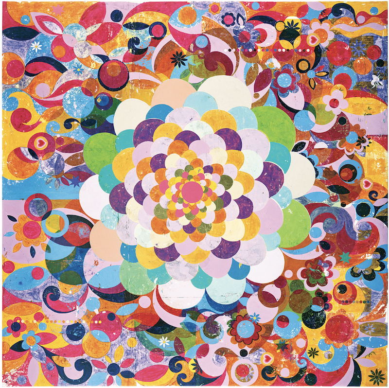
Circles expand across the surface. Flowers unfold into wheels, mandalas, targets, and suns. Stripes, lace patterns, arabesques, leaves, waves, diamonds, and ornamental borders overlap in intense fields of pink, red, orange, green, blue, yellow, purple, black, silver, and gold.
The work is bright, pleasurable, rhythmic, and visually abundant.
Yet the paintings are not simply celebrations of color.
Their surfaces contain conflict:
Organic forms collide with hard geometry.
Decorative motifs compete with structural grids.
Transparency allows layers to coexist while making them difficult to separate.
Repetition creates harmony and visual pressure at the same time.
Brazilian cultural sources meet the history of European abstraction.
Handmade irregularity survives inside highly controlled compositions.
Beauty attracts the viewer while density prevents easy consumption.
Milhazes creates paintings that feel exuberant without becoming uncontrolled.
Their deepest force comes from the tension between freedom and discipline.
The Problem Beneath the Work
Milhazes repeatedly returns to a central artistic problem:
How can painting transform ornament, nature, popular culture, craft, and inherited abstraction into a visual system where beauty remains intense without becoming passive decoration?
Her paintings are not simply colorful abstractions.
They bring together visual languages that have often been separated by cultural hierarchies:
Fine art and applied art
Modernist abstraction and decorative tradition
European geometry and Brazilian popular culture
Intellectual structure and sensual pleasure
Mechanical repetition and handmade variation
Botanical growth and architectural control
Milhazes does not resolve these differences by making one tradition dominate the others.
She constructs a surface where they remain active together.
White Cube describes her paintings as poised between order and chaos, rational structure and spontaneity, as well as between European and Brazilian modernisms. That tension provides a useful entry into the work: the paintings are not chaotic despite their abundance, and they are not rigid despite their geometry. (White Cube)
They occupy the unstable point where control becomes exuberance and exuberance nearly overwhelms control.
Decoration Without Apology
Decoration has often occupied an uncertain position within modern art.
It can be associated with:
Domestic interiors
Textiles
fashion
wallpaper
ceramics
festivals
feminine labor
popular taste
commercial design
visual pleasure
These associations have sometimes caused ornament to be treated as secondary to supposedly more serious artistic concerns.
Milhazes rejects that hierarchy.
She does not use pattern quietly or defensively. She enlarges it, layers it, intensifies it, and allows it to dominate the canvas.
Flowers become monumental.
Lace-like forms become structural.
Decorative circles organize entire compositions.
Repeated motifs create systems as rigorous as geometric abstraction.
The work suggests that visual pleasure does not need to justify itself by becoming austere.
But pleasure alone is not enough.
Milhazes makes decoration serious because ornament determines:
How the eye moves
Which forms dominate
What becomes visible
Where the composition accelerates
Where it becomes congested
How cultural sources collide
How figure and ground exchange roles
How control survives inside abundance
Decoration does not sit on top of the painting.
It is the painting’s method of thought.
Beauty Under Pressure
The paintings are undeniably beautiful, but their beauty is not calm.
Each form competes for attention.
A large circular motif may dominate the center, only to be interrupted by stripes, floral fragments, smaller discs, curving bands, transparent color, or sharply contrasting geometry.
The eye is pulled in several directions.
One pattern establishes order.
Another crosses it.
A flower appears complete.
A neighboring form cuts through it.
A color creates harmony.
Another color disrupts that relationship.
Beauty becomes active because it must continually negotiate conflict.
This is the difference between a decorative surface and a pressurized decorative surface.
A decorative surface may offer immediate harmony.
Milhazes’s paintings offer harmony that is continuously being challenged.
The viewer receives pleasure, but not rest.
The Transfer Process
Milhazes developed a distinctive transfer technique in 1989 based on a dry-monotype process. She paints separate shapes and motifs onto transparent plastic sheets, builds the acrylic into transferable films, adheres those forms to canvas or linen, and then peels the plastic away. (Beatriz Milhazes)
This method is essential to the work.
Rather than painting every motif directly onto the canvas, she constructs the image through prepared fragments.
Each form is made separately before entering the larger composition.
This creates a process closer to:
Collage
Printmaking
assemblage
transfer
construction
choreography
The motif can be planned, repeated, reversed, moved, layered, and positioned.
But the transfer is not perfectly predictable.
Paint may crack.
Sections may fail to adhere.
Earlier traces can remain on the plastic.
The transferred form may carry imperfections from its movement between surfaces.
The process therefore combines control with loss.
Milhazes can design the image carefully, but the material does not obey completely.
That tension mirrors the larger structure of the paintings:
Order is built through a process that preserves accident.
Painting at a Remove
The transfer process also creates distance between the artist’s hand and the finished surface.
A direct brushstroke records the immediate contact between brush and canvas.
Milhazes’s forms pass through an intermediate stage.
The paint touches plastic first.
It dries.
It becomes a removable skin.
It is transferred.
The original painted surface is reversed and repositioned.
This distance changes the meaning of gesture.
The work remains handmade, but it does not rely on spontaneous expression in the conventional sense. The artist’s authority lies partly in constructing the system through which the forms meet.
The paintings therefore complicate the distinction between:
Painting and collage
Original and reproduction
Gesture and design
Handmade and mechanical
Spontaneity and planning
Surface and object
A motif may look direct and immediate even though it has undergone several stages of separation and transfer.
Imperfection Inside Precision
The paintings can look exceptionally polished from a distance.
The circles appear sharp.
Patterns repeat.
Colors remain bold.
Large compositions feel deliberate.
But closer inspection often reveals fractures, abrasions, gaps, marks, and irregular edges created by the transfer process.
These imperfections matter.
Without them, the work might become too smooth, commercial, or mechanically decorative.
The damage provides resistance.
It reminds the viewer that each immaculate-looking form has undergone physical change.
A transferred motif is never identical to its original state.
Something may be lost in the movement.
Something new may appear.
This makes the surface historical.
Each shape carries evidence of how it arrived.
Nature Transformed into Structure
Flowers, leaves, vines, waves, and botanical forms appear throughout Milhazes’s work.
But the paintings are not conventional images of nature.
A flower may become:
A geometric center
A wheel
A rotating system
A mandala
A target
A burst of energy
A decorative emblem
A compositional machine
Nature is translated into rhythm and structure.
The organic motif does not remain naturally irregular. It may be repeated, flattened, mirrored, enlarged, or placed inside a geometric system.
At the same time, geometry does not remain cold.
Circles bloom.
Lines ripple.
Grids pulse with color.
Hard structures begin to behave like living forms.
The paintings do not separate nature from abstraction.
They allow each to transform the other.
Rio de Janeiro as Visual Pressure
Milhazes’s visual language is rooted in Rio de Janeiro, where she was born in 1960 and where her practice developed. Her work draws from the city’s tropical environment and from Brazilian visual culture while remaining deeply engaged with international histories of abstraction. (pacegallery.com)
Relevant sources include:
Botanical gardens
tropical vegetation
Carnival
festival decoration
popular textiles
jewelry
architecture
ceramics
lace
music
graphic design
Brazilian modernism
But the paintings should not be read as simple expressions of Brazilian exuberance.
That interpretation risks reducing a complex visual language to a cultural stereotype.
Milhazes does not merely reproduce the appearance of Rio.
She translates its density, rhythm, collision, color, and mixture into an abstract system.
The city becomes less a depicted location than a condition of visual coexistence.
Different histories and patterns occupy the same field without becoming identical.
Brazilian and European Modernisms
Milhazes’s paintings engage both Brazilian modernism and European abstraction.
Her sources and affinities have been associated with figures such as:
Henri Matisse
Piet Mondrian
Sonia and Robert Delaunay
Henri Rousseau
Bridget Riley
Tarsila do Amaral
Roberto Burle Marx
The significance does not lie in identifying each quotation.
It lies in how these traditions are reorganized.
European modernism often pursued formal reduction, geometric order, optical structure, and the autonomy of painting.
Brazilian modernism absorbed international languages while transforming them through local environment, culture, history, and questions of national identity.
Milhazes brings those histories into contact with ornament, popular imagery, botanical forms, and intense chromatic pleasure.
Geometry no longer needs to remain austere.
Decoration no longer needs to remain outside modernism.
Color does not merely fill structure.
Color becomes structure.
Her work exists at what White Cube calls the “biting point” between European and Brazilian modernisms, where neither source remains unchanged. (White Cube)
Color as Structure
Milhazes does not use color only to produce mood.
Color organizes the painting.
A large red circle may anchor the composition.
A field of blue may create depth before a bright floral motif flattens it again.
Black lines may divide competing areas.
Pinks and oranges may unite forms that differ in scale or pattern.
Contrasting colors can produce vibration along an edge.
Repeated colors can connect distant parts of the canvas.
The viewer may initially experience the color emotionally:
Joyful
tropical
festive
luxurious
excessive
playful
But the color is also architectural.
It determines hierarchy, weight, rhythm, and movement.
This is why the paintings can support so much visual information without collapsing completely.
Color is not added to the structure.
It builds the structure.
Circles as a Generative Lexicon
Circles recur throughout Milhazes’s practice.
They may appear as:
Flowers
wheels
suns
targets
discs
mandalas
eyes
records
decorative medallions
spinning forms
The circle offers several advantages.
It can suggest both stillness and rotation.
It can create a stable center while generating movement around that center.
It can appear organic or geometric.
It can expand outward or contract inward.
It can overlap without establishing a conventional horizon.
It can become an image or remain an abstract structure.
Repeated circles make the paintings feel musical.
One disc establishes a beat.
Another interrupts it.
Smaller circles create faster rhythms.
Large circles slow the composition and provide weight.
The circle becomes less a signature than a flexible piece of visual vocabulary.
Its meaning changes according to scale, color, pattern, and position.
Layers Without Conventional Depth
Milhazes’s paintings contain many overlapping forms, yet they do not create conventional illusionistic space.
One shape covers another.
Transparent areas reveal what lies below.
Patterns move forward and backward.
But the painting repeatedly returns attention to the surface.
Depth exists as accumulation rather than as perspective.
The viewer does not enter a believable three-dimensional world.
The viewer moves through stacked visual events.
This makes the work feel spatial without becoming pictorially deep.
The space resembles memory, music, collage, or cultural history:
One layer interrupts another.
Earlier material remains partially visible.
Separate sources coexist.
No single viewpoint controls the whole.
The surface contains several times at once.
Rhythm and Music
Milhazes’s compositions often feel musical.
Forms repeat with variation.
Lines establish tempo.
Color returns like a refrain.
Large motifs create sustained notes.
Small patterns produce rapid movement.
Transparent layers allow several rhythms to operate simultaneously.
The painting can feel like a visual arrangement in which no single instrument completely dominates.
Music is especially relevant because it offers structure without requiring narrative.
A song can create progression, tension, repetition, release, interruption, and return without depicting an event.
Milhazes’s paintings behave similarly.
The eye experiences sequence even though the entire image is visible at once.
Order and Chaos
The paintings often appear close to visual overload.
This danger is central to their force.
Too much structure would make them rigid.
Too much activity would make them arbitrary.
Milhazes works between these extremes.
Order appears through:
Repeated geometry
central motifs
balanced color
recurring circles
grids
stripes
controlled transfer
compositional hierarchy
Chaos appears through:
Overlap
collision
density
conflicting patterns
chromatic intensity
imperfect transfer
sudden scale changes
competing centers
The painting remains alive because neither force wins.
Order prevents collapse.
Chaos prevents sterility.
The deeper contradiction is:
The work creates visual freedom through extreme discipline.
The Viewer’s Position
Milhazes places the viewer inside abundance.
The viewer is first seduced
Color and pattern create immediate pleasure.
The work does not require theoretical knowledge before the visual encounter begins.
The viewer becomes a navigator
Once inside the painting, the eye must determine how to move through competing motifs and layers.
There is rarely one simple path.
The viewer becomes physically aware of scale
Large floral and geometric forms can become environmental. What might resemble a small decorative motif in another context expands until it confronts the body.
The viewer becomes uncertain about hierarchy
Is the central flower the subject?
Are the surrounding patterns background?
Does the grid organize the ornament, or does the ornament overwhelm the grid?
Figure and ground continue to exchange roles.
The viewer becomes aware of pleasure
The work raises a question often avoided in serious criticism:
Why should intense visual pleasure be considered intellectually suspicious?
Milhazes does not separate pleasure from complexity.
She makes pleasure the entrance into complexity.
The Central Contradictions
Milhazes’s paintings hold multiple opposing forces together:
Decorative and rigorous
Organic and geometric
Brazilian and international
Handmade and mechanically repeated
Controlled and accidental
Beautiful and overwhelming
Flat and spatially layered
Festive and disciplined
Historical and contemporary
Precise and damaged
Harmonious and competitive
Immediate and slow to comprehend
The deepest contradiction may be:
The paintings appear spontaneous and exuberant even though they are produced through slow planning, transfer, revision, and control.
Freedom is not the absence of structure.
It is the effect created by structure working at its highest intensity.
The World Milhazes Has Built
Her recurring lexicon includes:
Flowers
circles
arabesques
lace
stripes
grids
leaves
waves
diamonds
medallions
jewelry-like details
botanical forms
Carnival references
transparent layers
geometric fragments
ornamental borders
vivid color relationships
These elements create a recognizable world, but they do not remain fixed.
A flower can become geometry.
A circle can become architecture.
A stripe can become movement.
Lace can become an abstract network.
A decorative fragment can become the structural center of a monumental canvas.
This constant reassignment prevents the vocabulary from becoming merely ornamental branding.
The motifs keep changing jobs.
The Evolution Toward Geometry
Milhazes’s work has evolved across decades, moving from dense ornamental arabesques toward compositions in which geometric abstraction has become increasingly prominent, while color remains central. A 2025 Guggenheim presentation spanning works from 1995 to 2023 emphasized this development and the continued tension between rigor and beauty. (Vogue)
This evolution is important because it shows that the practice is not dependent on one successful decorative formula.
The vocabulary can change while the central problem remains intact.
Earlier works may feel more floral, layered, intimate, and ornamental.
Later paintings may introduce larger geometric divisions, clearer edges, and more open space.
But the deeper tension persists:
Sensuality and order
Cultural mixture and formal rigor
handmade process and constructed appearance
visual pleasure and compositional pressure
The world evolves without losing its governing intelligence.
The Risk of Decorative Spectacle
Milhazes’s work carries a clear risk.
The paintings are highly photogenic.
Their bright colors and bold patterns can create immediate appeal on screens, in design contexts, and in commercial reproduction.
This creates the possibility that the work will be consumed too quickly as:
Cheerful color
tropical abundance
luxury decoration
visual optimism
Instagram-friendly pattern
Brazilian exoticism
The critical question is therefore:
Does a painting create a governed conflict among its forms, or does it merely reproduce the appearance of Milhazes-style abundance?
The strongest works do more than fill the canvas attractively.
They establish competing systems of rhythm, hierarchy, transparency, scale, and cultural reference.
The pleasure remains active because it is difficult to stabilize.
The weaker possibility would be ornament without pressure.
Why the Work Belongs to the Present
Milhazes’s paintings address a contemporary condition in which cultural identity is formed through mixture rather than purity.
Visual languages move across:
Nations
art history
craft
fashion
advertising
architecture
music
digital imagery
popular festivals
museums
domestic life
Her work does not pretend that artistic influence follows one clean line.
It accepts that a contemporary image may contain local memory, international modernism, decorative tradition, mass culture, personal taste, and historical contradiction at once.
The paintings also challenge inherited hierarchies separating:
Fine art from craft
Seriousness from beauty
intellect from pleasure
modernism from ornament
structure from decoration
cultural specificity from international abstraction
Their present-tense force lies in their refusal to choose one side.
What Artists Can Learn
The lesson is not to imitate Milhazes’s flowers, circles, bright palette, transfer technique, Brazilian references, stripes, lace, or ornamental density.
Those are the visible solutions produced by her particular investigation.
The larger lesson is that decoration becomes powerful when it is treated as structure rather than embellishment.
Milhazes demonstrates that:
Beauty can carry intellectual rigor.
Pattern can organize attention.
Color can build architecture.
Repetition can produce musical rhythm.
Ornament can hold cultural memory.
Geometry can become sensual.
Nature can be transformed rather than illustrated.
A controlled process can preserve accident.
Imperfection can prevent polish from becoming sterile.
Cultural sources can coexist without being flattened into one style.
Visual pleasure becomes deeper when several systems compete beneath it.
A recognizable lexicon can evolve without losing coherence.
The paintings do not choose between rigor and beauty.
Their rigor produces beauty.
Their beauty conceals labor.
Their order generates exuberance.
Their ornament becomes structure.
Their imperfections reveal process.
Their cultural mixture becomes a visual world.
The lesson is not to copy the appearance of the work. It is to understand the pressure that made the appearance necessary.
Beatriz Milhazes turns decoration into a disciplined field where color, culture, nature, geometry, and pleasure remain in continuous, productive collision.